

Digital marketers spend day in and day out working with a wealth of data – in many cases to the point where it can be considered an art form. This includes data in the realm of customer experience as well as marketing-related Key Performance Indicators (KPIs), such as advertising campaigns and spending, website clicks, online sales and email marketing.
While every marketer knows that this data is key when it comes to gauging customer experience or measuring ROI, it’s not always easy to make sense of it all; a struggle which has led to the emergence of data analysis and dashboarding visualisation tools.
Visualising data through dashboards is a very modern approach to analysing and organising your marketing data. But why are these tools so popular? Well it’s very simple. Dashboards simplify the analysis process by gathering all data and displaying it in one location. As a provider of specialised feedback analysis software, we find these types of tools to be a great way of reporting overall metrics and diving into specific data sets. We have also learned a great deal from these tools and applied those learnings in the development our own products. This blog illustrates our learnings from these great applications, down to every last detail.
Which attributes are needed to make a good dashboard?
- Make it your own: Being able to customise your dashboards is ideal as it enables you to provide a good representation of what you or your company’s priorities are.
- On-the-go access: This feature gives marketers the opportunity to access their dashboards from anywhere on their mobile.
- Scalable: It’s important for your dashboard to be able to take on a multitude of data sources and grow with your business.
- Collect unlimited feedback
- ■
- Free 14 day trial
When looking at the different data analysis and dashboard tools, there are about ten that really resonate with us. We will go through and take a deeper look at each of these tools and we have identified key features, the advantages and their Unique Selling Proposition (USP):
1. Klipfolio
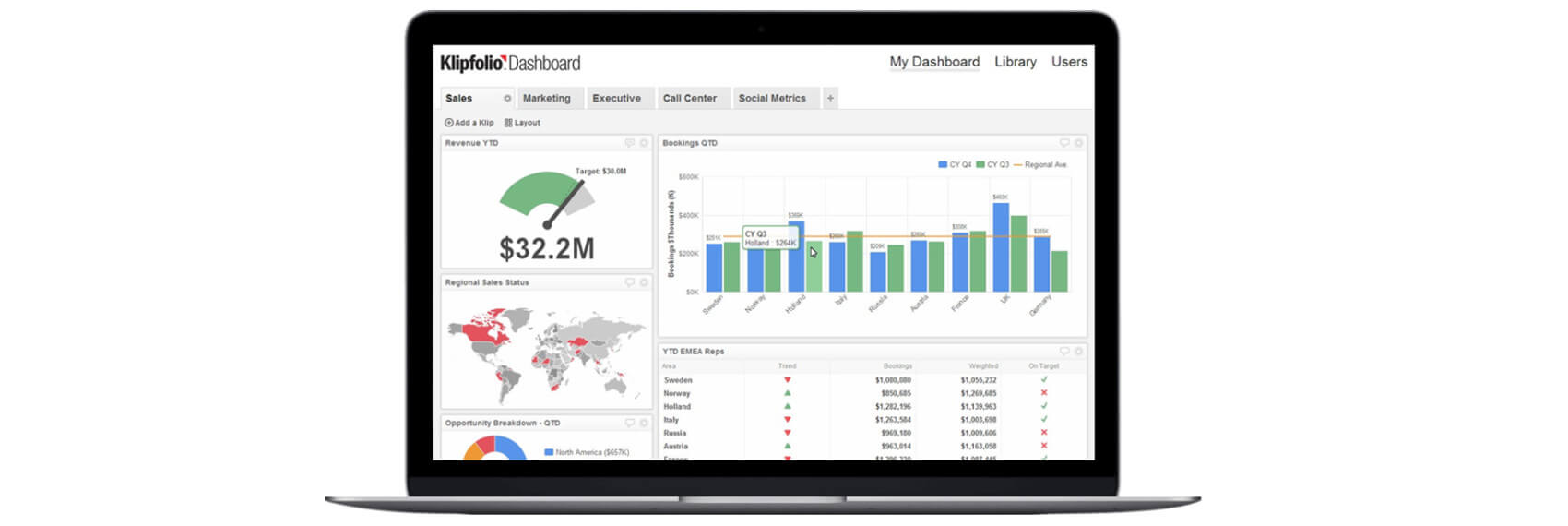
Source: Klipfolio
Klipfolio is an online dashboard platform that allows you to create multiple real-time dashboards quickly and easily. With Klipfolio, results can be compared easily using targets which can be adjusted quickly. The tool supports more than 100 cloud applications, including Google Analytics, HubSpot, Facebook and SalesForce. The dashboard is easy to set up and in terms of data links, very flexible. The disadvantage of Klipfolio is that it – just like many other tools – has a learning curve. When you need more, Klipfolio can be a complex and time-consuming tool. The pricing for Klipfolio is reasonably low: you can use the platform by paying $24 a month.
USPs:
+ Simple set up
+ Various data sources can be collected in one widget
+ Accessible on all devices, so you can use it wherever and whenever
+ The data is visualised and can be completely customised to your corporate identity.
Website: www.klipfolio.com
2. Datapine
Source: Datapine
Datapine is a powerful business intelligence & dashboard tool, that enables everyone within the company to build dynamic, interactive online dashboards with ease. Thanks to over 80 professional dashboard templates for different business functions (marketing, sales, HR, IT, etc.) and industries (retail, logistics, healthcare, manufacturing, etc.) the initial dashboard creation takes only a few clicks. Nonetheless, datapine’s dashboards are highly customizable and users can take advantage of a wealth of interactive dashboard features such as drill-downs, drill-throughs, time interval widgets or chart zooms. The dashboards can be shared in multiple ways, including automated Email reports, live dashboards via URL, a secure viewer area as well as embedded dashboards. Datapine offers a 14-day free trial without any limitations.
USPs:
+ Intuitive drag and drop user interface;
+ Over 80 professional dashboard templates;
+ Interactive dashboard features & multiple reporting options;
+ Free POC dashboard & optional data analytics services.
Website: www.datapine.com
3. Cyfe

Source: Cyfe
Cyfe is an online, all-in-one dashboard that brings together all marketing channels, web analytics, finances, sales and social media. It looks similar to the Geckoboard platform. The tool is free if using a maximum of five different dashboards. The dashboards can be shared with everyone, including your team and clients. Data reports are mailed automatically in PNG, JPEG, PDF and CSV formats. The only disadvantage of Cyfe is that you have little variation in the panel design. In addition to the free option, there is a “Premium” version that costs only $19 per month. With this Premium account, you can add an unlimited number of dashboards, widgets and users.
USPs:
+ Up to five dashboards is free at Cyfe
+ Easy to use
+ 60 popular services are built in
+ Data history is archived
Website: www.cyfe.com
4. Geckoboard
Source: Geckoboard
Geckoboard is a tool for collecting, visualising and sharing important information within your company. The Geckoboard dashboard platform allows you to track important information in real-time from one place. The dashboard aims to give you a clear overview of the most important KPIs with possibilities to share the data on TV screens. With more than 80 integration options, there is always at least one option for your company. And if not, you can also implement your own data by linking your dashboard to a database API. With the Geckoboard mobile app, you can access your dashboard wherever and whenever you like.
Disadvantage: The mobile app is only available for iPhone users. Interested parties can use Geckoboard for free for one month. What are the costs after one month? For $25 a month, you too can use Geckoboard.
USPs:
+ Dashboard gives a good overview
+ Lots of useful features, such as the ability to share read-only versions of your dashboard, or to show the dashboard under your own domain name.
+ Raw data can easily be converted into simple, understandable visualisations
Website: www.geckoboard.com
5. SiSense

Source: SiSense
SiSense is a business intelligence platform which allows everyone to convert complex data into understandable insights. SiSense collects and manages data from multiple sources. The data comes to life in an interactive online dashboard where you can choose from various visualisation options. The drag-and-drop interface enables you to collect data from different sources and put it in one place, where it can be shared with your team, partners and clients. Using the built-in connectors, you can easily implement apps such as SalesForce, Adwords and Google Analytics. You can try out SiSense for one month free.
USPs:
+ Interface is easy to use
+ With little effort you can turn analysis into visual reports
+ With SiSense’s “Elasticube”, you can easily take snapshots of your data
Website: www.sisense.com
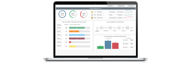
6. GoodData
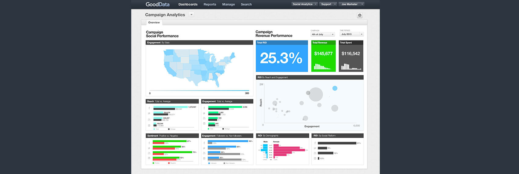
Source: GoodData
GoodData is a Business Intelligence system that offers Platform-as-a-Service (PaaS) geared mainly towards enterprises. The platform combines data management and security, just what you need for self-service BI. The IT department controls the “behind-the-scenes” activities (such as maintaining infrastructure and security) and in the meantime, the users can create dashboards and reports. GoodData’s platform consists of five steps: collecting, saving, combining, analysing and visualising. The data can be imported from various data sources – from traditional databases and cloud-based sources to public data sources. You can visualise data via interactive dashboards and have access to countless graphs and tables.
GoodData is perfect if you are engaged in the marketing, sales, and/or customer services branch, as the platform offers personalised analysis including pre-built templates. Interested parties can request a demo. The price is on request, but do not be surprised by the price. It may turn out to be quite high. But then of course, you get good value for your money.
USPs:
+ GoodData has a strong encryption and security
+ The platform provides a single tool for multiple users by means of an Extract Transform Load (ETL) process
+ The dashboards look sleek and the user interface works perfectly
+ The platform integrates seamlessly with other SaaS products
Website: www.gooddata.com
7. Infor Birst

Birst is a cloud-based Business Analytics platform that makes company information available to end-users. With a short “time-to-report”, you can easily make analyses and reports with data from multiple sources. What is unique with this platform is that it is completely Cloud-Based and the ETL (Extraction,Transformation and Load) process is integrated.
Birst can easily integrate enterprise-wide data sources and local department sources. The software is available in two versions: the Discovery edition and the Enterprise edition. If you’re looking for complex analyses, you’re in the wrong place at Birst. The software is used particularly for organisations with a staff of around 500 employees. Birst is therefore less suitable for large companies. Are you curious about the Birst software? You can order a free “Buyer’s Guide” on the website.
USPs:
+ Birst works entirely with HTML5, so there are hardly any issues with scalability and performance
+ New releases are brought out regularly
+ Easy to use
Website: www.infor.com
8. Tableau

Tableau is a Business Intelligence software for data discovery and data visualisation. With the software you can easily analyse, visualise and share data, without IT having to intervene. Tableau supports multiple data sources such as MS Excel, Oracle, MS SQL, Google Analytics and SalesForce. Tableau is free for personal use. However, if you want more, the price can go up quickly. But of course, this will give you something in return: well-designed dashboards that are very easy to use. Additionally Tableau also offers three standalone products: Tableau Desktop (for anyone) and Tableau Server (analytics for organisations), which can be run locally and Tableau Online (hosted analytics for organisations).
USPs:
+ No technical knowledge is required to use Tableau
+ Works well on mobile devices
+ Tableau has a large community, resulting in a collaboration with users making “best practices” easy to achieve.
Website: www.tableau.com
9. Qlik

Source: Qlik
Qlik is a Business Intelligence data discovery product that enables your company to make tailored analyses and dashboards. The Qlik platform is managed by the Qlik Indexing Engine (QIX) – a powerful engine for associative data indexing. The platform consists of several sub-categories including QlikSense, Qlik Data Market and the most used tool, QlikView. The QlikView platform provides self-service BI, enabling business users to make innovative decisions. This is an ideal platform but there is of course one disadvantage: it can be somewhat difficult to build well-functioning dashboards. Luckily there is always someone from Qlik available to help get you started. After watching the demo, you can download a free trial version is to see if the software is good for your business. Do you like Qlik? The software is free for personal use. However, for companies, it depends which Qlik category you choose.
USPs:
+ Qlik’s QIX engine optimises the speed in the memory and compresses data up to 10% of its original size
+ The self-built dashboard is responsive on any device
+ The library model enables users to can put previously built data models, visualisations and analysis sheets back into the system
Website: www.qlik.com
10. Domo

Source: Domo
Domo is a completely cloud-based business management platform that integrates multiple data sources, including spreadsheets, databases and social media. Domo is used by both small companies and large multinationals. The platform offers micro and macro level visibility and analyses. From cash balances and listings of your best selling products by region to calculations of the marketing return on investment (ROI) for each channel. The only let down about Domo is that it is difficult to download analyses from the cloud for personal use. The pricing for Domo depends on which phase your company is in: for starters it’s free and then pricing starts at $175 a month per user to use Domo.
USPs:
+ Interactive visualisation tools
+ Unlimited access to Domo’s global data via personalised dashboards
+ Easy to use
Website: www.domo.com
Curious about the different possibilities around data analysis and dashboard tools? Want to learn more about how you can apply these tools in your customer feedback program? Want to learn more about Mopinion’s all-in-1 user feedback platform? Don’t be shy and take our software for a spin! Do you prefer it a bit more personal? Just book a demo. One of our feedback pro’s will guide you through the software and answer any questions you may have.
Ready to see Mopinion in action?


