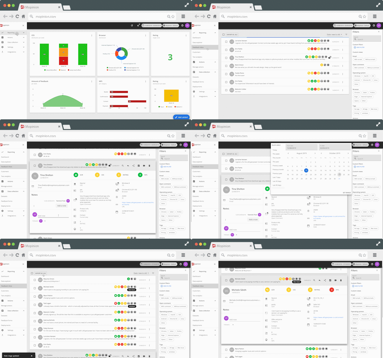
The rumors are true. The newest version of Mopinion’s software, known as Mopinion Raspberry, is set to go live in January 2020. With rigorous testing and refinement processes in full swing, we’d like to take these next few months to slowly introduce you to Mopinion Raspberry. In this five-part series, we will ‘unmask’ various new components of the software one by one; components that are guaranteed to give you a smooth and lucid user experience.
But before we get started with this series of ‘sneak peeks’, let us bring you up to speed with the project, starting from the beginning…
The Creation of Mopinion Raspberry
There have been massive developments in front-end technology over the last few years; developments which have unleashed new possibilities for delivering a better user experience, allowed for more complex and interesting user interactions, and have increased the scalability of applications. That being said, it was time for Mopinion to evaluate other options and find ways to make our own user interface more scalable and efficient for our users.

Still from our video, Sneak Peek into the Mopinion Raspberry’
After evaluating our options, we decided upon rewriting our application’s front-end code using React, a JavaScript library built by Facebook. A perfect fit for Mopinion, this library allows us to declaratively describe the User Interface using dynamic data and for that interface to change when the data changes.
Anwar Jebali, Senior Web Developer & Front-End Team Lead:
“Based on feedback from customers, qualitative user research and data analysis, we found ways to improve important user flows such as building deployments, navigating the inbox and setting up charts and dashboards. In short, React will enable us to increase the scalability of our app as well as allow us to roll out new features faster and deliver a more consistent experience.”
In this video Anwar gives a short introduction to Mopinion Raspberry.
A Five-Part Introduction Series
This blog series will introduce the five main components of Mopinion Raspberry – the new user interface – identifying the benefits that these new and improved components will bring to the user as well as some teaser footage:
- The Navigation
- The Feedback Form Builder
- The Feedback Inbox
- The Dashboard & Text Analytics
- The Data Explorer & Chart Builder
Now let’s get started with unmasking one of the most fundamental changes: the Navigation.
Unmasking the Navigation
The navigation of an application should always be two things: straightforward and intuitive. And that’s precisely what our main focus was when creating this new version of the software. We wanted to make the navigation more logical and accessible so as not to interrupt the user experience.
Our fresh and intuitive new navigation enables users to:
- Easily flip through reporting, actions and data collection pages using a single sidebar
- Switch swiftly from project to project in just two clicks
- Easily adjust your date selection using the ‘Quick Select’ option

Then, we took it one step further…
We’ve added a Quick view sidebar, which will serve as an aid in quickly and easily carrying out actions without having to click multiple times to go back to what you were working one. For example, users can zoom in on feedback details while staying within the context of the page.
Moreover, the new Quick view sidebar will enable users to:
- Open feedback details from charts, text analytics, survey list, data set list and more
- Switch or change the range of dates straight from the sidebar
- Add actions, reply to notes or add tags from the quickview

Straightforward and intuitive…
As you can see, these two components: the new navigation and quick view sidebar will make analysing user feedback much more simple. Not only will they allow for more complex user interactions, but these features also stay true to the Mopinion look and feel.
That’s all for now folks! But don’t worry, this is just the first sneak peek of the series. In the coming weeks we will slowly unveil more new and improved components of Mopinion Raspberry, so stay tuned!
We are looking for beta testers!
[For existing customers only]


