
Have you ever wondered why your users don’t interact with your product the way you were expecting them to? It might be because you may not understand how to use different psychology principles to design your products to elicit specific responses and actions from your users. Your customers are driven by emotions when they are looking at a website, wondering if they should buy a product or not. They are instinctively trying to establish a connection with the brand and, depending on what they see, they will either complete the purchase or not.
This is a guest post by freelance writer and UX designer, Leona Henryson.
Psychology has an important role in designing the user experience because some principles influence human behavior.
The psychological principles below will help you create an engaging UX website design:
1. Understand Hick’s Law
Applying Hick’s law is the best way to make the choice easier for users because, according to this law, the time it takes to make a decision depends on how many options are given. According to the Interaction Design Foundation, Hick’s law can be used by designers to scatter navigation items throughout the design in small, discrete clusters. These will help narrow down huge volumes of information without overloading the user.
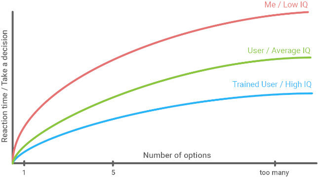
Source: UX Planet
Offer limited options to choose from because the more choices you offer to your customers the more time they will spend on your website without deciding which items to buy. If you offer them a clear list of items, they will make the decision faster.
Free White Paper: A Digital Feedback-Fueled Approach to Personalisation
A guide to Personalising the Digital Customer Experience (CX) with Online Feedback.
2. Visual perception
The principle of visual perception in UX design has been implemented thanks to Gestalt’s theory. According to this theory, our brain processes information in a fascinating way by making us subconsciously group together separated objects to perceive them as a whole. The principles of the theory are organized into six categories:

Source: Webkraft
- Law of Symmetry: Symmetry is aesthetically pleasing for our brains so when we look at certain objects, we tend to see them as symmetrical shapes.
- Law of Proximity: elements that are placed close together are perceived as a group. Thus, several distinct objects placed in close proximity are seen as one unit.
- Law of Similarity: similar objects that are placed in close proximity to each other are, once again, perceived as a single unit.
- Figure and ground: users can switch between an object and its surrounding area that represents the ground to perceive different images.
- Law of Closure: although an object might be incomplete, our brains fill in the missing information to allow us to perceive it as a whole.
- Law of Continuity: the law of continuity is based on the creation of curved lines that allow the eye to flow with the line. It leads to the psychological phenomenon when the eye is encouraged to move through one object and continue to another one.
3. Visuals dominate but text matters too
While visual content plays a key role in promoting brands, ideas, and businesses, the visual strategy must be fluid with the message. According to Ben Ratcliff, a UX writer at FreeEssayWriters,
The written content is just as important as the design and aesthetics of your website to ensure the message you want people to know about your brand is properly transmitted”
You can use the following tools for comprehensive and engaging text in addition to the traditional tools for UX designers:
- Grammarly: this is a free online tool that picks up common spelling, grammar, and style mistakes for 100% grammatically correct content.
- Copyscape: this online tool will help you detect duplicate content and check if your text is original to avoid publishing a plagiarized text.

4. Respect the mental models of your users
The psychological principle of the mental models refers to the ones that your users have formed from experiences and expectations of the real world. We all have mental models of how to interact with objects or systems. Thus, the increasing time spent online has made your users form a mental model of how to interact with or what to expect from interfaces like your website.
Thus, to design effective online experiences, you need to match people’s mental models of what they expect to find on your website. For example, when accessing a website, people expect to find the navigation bar at the top or bottom of it. Thus, you should place them according to your visitors’ expectations. Also, place the most important elements like “Home” or “Profile” from left to right and improve your customers’ experience.
5. Psychology of colors
Color is a powerful tool that can be used to signal attention, influence moods, and even trigger psychological reactions. “Colors can have a huge impact on the emotions your users feel and it can also dictate their behavior when they interact with your website,” Ronak Meghani, the Co-Founder of Magneto IT Solutions, shares. “Used wisely, colors alone can persuade a visitor to make a purchase.”
For example, did you ever wonder why all sales signs are red? Because red is the color of action, it stimulates the body and incites urgency. Red also encourages appetite, which is why so many fast-food chains are using it.
As Joshua Porter shared, changing color of a single button can increase the click-through rate up to 21%.

Source: Joshua Porter via Hubspot
It is essential to use the colors which represent best the personality of your target audience to drive actions from inspiring honesty and security with blue to evoking emotions of urgency and action with red. For example, according to a study on color and psychological functioning, while promoting a financial or medical service using colors like black or blue would be more suitable because they are associated with formality and reliability, for children toys, you should choose colors like purple that encourage creativity or red that represents energy and action.
Conclusion
User experience design has its conceptual roots in cognitive and behavioral psychology and it is a blueprint of a human being’s interaction with a machine. No matter how smart and advanced machines get, the user will always operate it with the human mind that has some fairly unbreakable patterns and you can use these patterns in your favor to create the right user experience.
About the Author
Leona Henryson freelance writer and UX designer. Also, she is a contributing writer for various blogs, including Writersquad. When she is not writing or designing, she is swimming, hiking, and, weather permitting, snowboarding.
Ready to see Mopinion in action?
Want to learn more about Mopinion’s all-in-1 user feedback platform? Don’t be shy and take our software for a spin! Do you prefer it a bit more personal? Just book a demo. One of our feedback pro’s will guide you through the software and answer any questions you may have.