

Customer retention does not only depend on what happens after a purchase. It is also shaped by what users experience during the digital journey. If a website feels confusing, frustrating or difficult to use, visitors are less likely to return.
This is where website feedback widgets can help. By collecting direct feedback while users are still on the website, teams can better understand what is creating hesitation, frustration or drop-off.
That matters because poor experiences can quickly push customers away. PwC found that 52% of consumers stopped buying from a brand after a bad product or service experience, while Zendesk reports that more than half of consumers will switch to a competitor after just one bad experience.
In this blog, we’ll look at how digital feedback widgets help businesses identify user experience (UX) issues, improve the website experience and support stronger customer retention.
TL;DR – Article summary
If you want to improve customer retention, you need to understand what users are actually experiencing on your website. Website feedback widgets help you collect in-the-moment feedback at key touchpoints, making it easier to uncover usability issues, pain points and unmet expectations that analytics alone cannot fully explain. When used well, digital feedback helps teams improve journeys faster, remove barriers earlier and create experiences that give customers more reasons to come back.
In this blog, we will explore:
- Why analytics alone cannot explain why users leave
- How does digital experience affect customer retention?
- What are digital feedback widgets?
- Which website feedback widgets should you use?
- How website feedback widgets help identify UX issues
- How to implement website feedback widgets effectively
- How to use digital feedback widgets without disrupting the user journey
- Turning website feedback into retention improvements
- Final thoughts
Why analytics alone cannot explain why users leave
Many teams still rely too heavily on traditional, quantitative analytics to understand what is going wrong on their website. Analytics can show where users drop off, which journeys underperform and which pages get ignored. But they do not always explain why people are hesitating, getting frustrated or abandoning the process altogether.
Behavioural data shows what users did, but it rarely explains what they were experiencing at that point.
Analytics can usually show things like:
- where users drop off
- which pages have high bounce rates
- which journeys underperform
- where conversions stall
What those numbers do not always reveal is what caused the hesitation. Was the next step unclear? Was important information missing? Did something break on mobile? Did the form feel too long? Did the search results feel irrelevant?
This is why the strongest teams combine analytics with direct feedback. Behavioural data highlights where something is happening, while feedback helps explain what the user experienced. Together, they give you a much clearer view of what needs attention.
How does digital experience affect customer retention?
Customer retention is often associated with what happens after the sale: loyalty campaigns, email flows, account management and win-back strategies. Those things matter, but retention also starts much earlier. It begins the moment someone interacts with your website.
If the experience is smooth, relevant and trustworthy, users are more likely to continue. If it feels confusing, inconsistent or difficult, you are already giving them a reason to disengage.
A poor digital experience does not just affect a single visit. It shapes how people perceive your brand and whether they feel confident returning. That is why UX and retention are so closely connected. If your website creates unnecessary friction, it can quietly weaken retention before a customer relationship has had much chance to develop.

What are digital feedback widgets?
Digital feedback widgets are on-site feedback tools that allow visitors to share their thoughts while they are using your website. They help teams collect feedback in context, rather than relying only on assumptions, support tickets or delayed survey responses.
Because they sit inside the experience itself, they can capture feedback while the moment is still fresh. That makes it easier to understand what users are struggling with, what feels unclear and which issues may be affecting the experience. When used well, this kind of feedback helps teams remove barriers earlier, improve key journeys and create smoother experiences that support stronger customer retention.
Which website feedback widgets should you use?
Not every feedback widget should do the same job. The most useful approach is to match the widget to the moment in the journey and the question you are trying to answer. The stronger that match is, the easier it becomes to uncover experience issues that may be affecting whether users continue, convert or come back.
Feedback buttons
A feedback button gives visitors an ongoing way to share comments from anywhere on the site. It is useful when you want broader visibility into issues across the website and want users to report bugs, complaints or suggestions in their own time.
This format works well for ongoing discovery because it can surface issues teams did not know to investigate. From a retention perspective, that matters because recurring frustrations often go unnoticed until they begin affecting satisfaction, trust or repeat visits.
On-page micro surveys
Short on-page surveys are useful when you want to ask a specific question at a specific moment. For example, after a visitor reads a help article, reaches the end of a checkout step or interacts with a product page, you might ask whether they found what they needed.
These should stay brief. The goal is to make feedback easy to give without interrupting the experience too much. For retention, micro surveys can help teams understand whether important pages are actually supporting users or quietly creating confusion that may discourage them from returning.
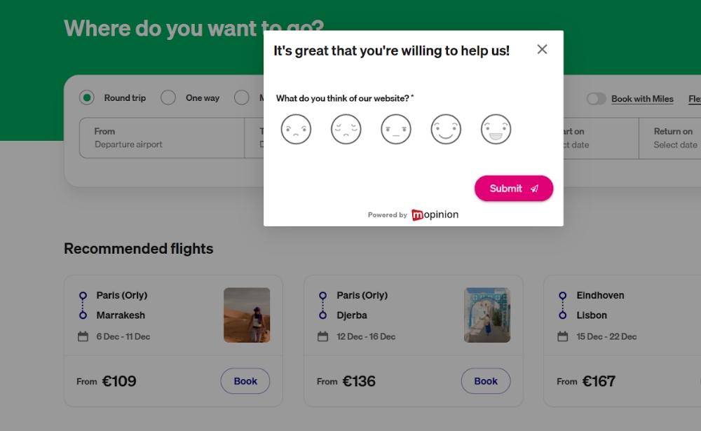
This is a Transavia website feedback form that uses a smiley-based rating scale to quickly capture how visitors feel about the website experience while browsing the booking page.
Exit-intent feedback
Exit-intent forms can help you understand why users are leaving, particularly on pages with high abandonment. However, they need to be used carefully. If they appear too often or interrupt the experience too aggressively, they can add to the problem rather than helping you understand it.
When used selectively, they can reveal what is stopping users from continuing, whether that is missing information, pricing concerns, poor usability or lack of trust. Those insights can help teams reduce abandonment and improve the parts of the journey that influence whether visitors come back.
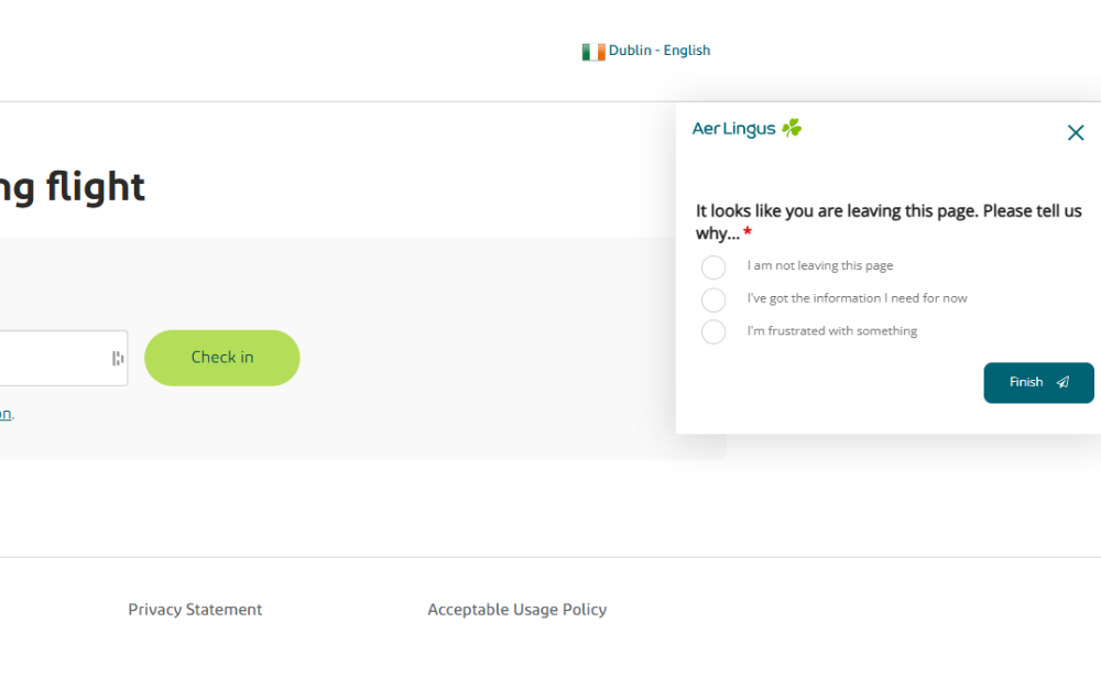
This Aer Lingus exit-intent form appears when a user is about to leave the page and asks why, helping the airline understand whether visitors are leaving because they no longer need information, are staying on the page, or are experiencing frustration.
Embedded feedback forms
Embedded forms sit within the page itself rather than appearing as overlays. These can work well for support centres, resource hubs or account areas where users expect a more stable, low-friction experience.
They are especially useful in areas where people are already trying to complete a task or solve a problem. If those moments go badly, retention can suffer quickly. Embedded feedback helps teams understand where self-service or support experiences may be falling short, so they can improve them before frustration leads to disengagement.

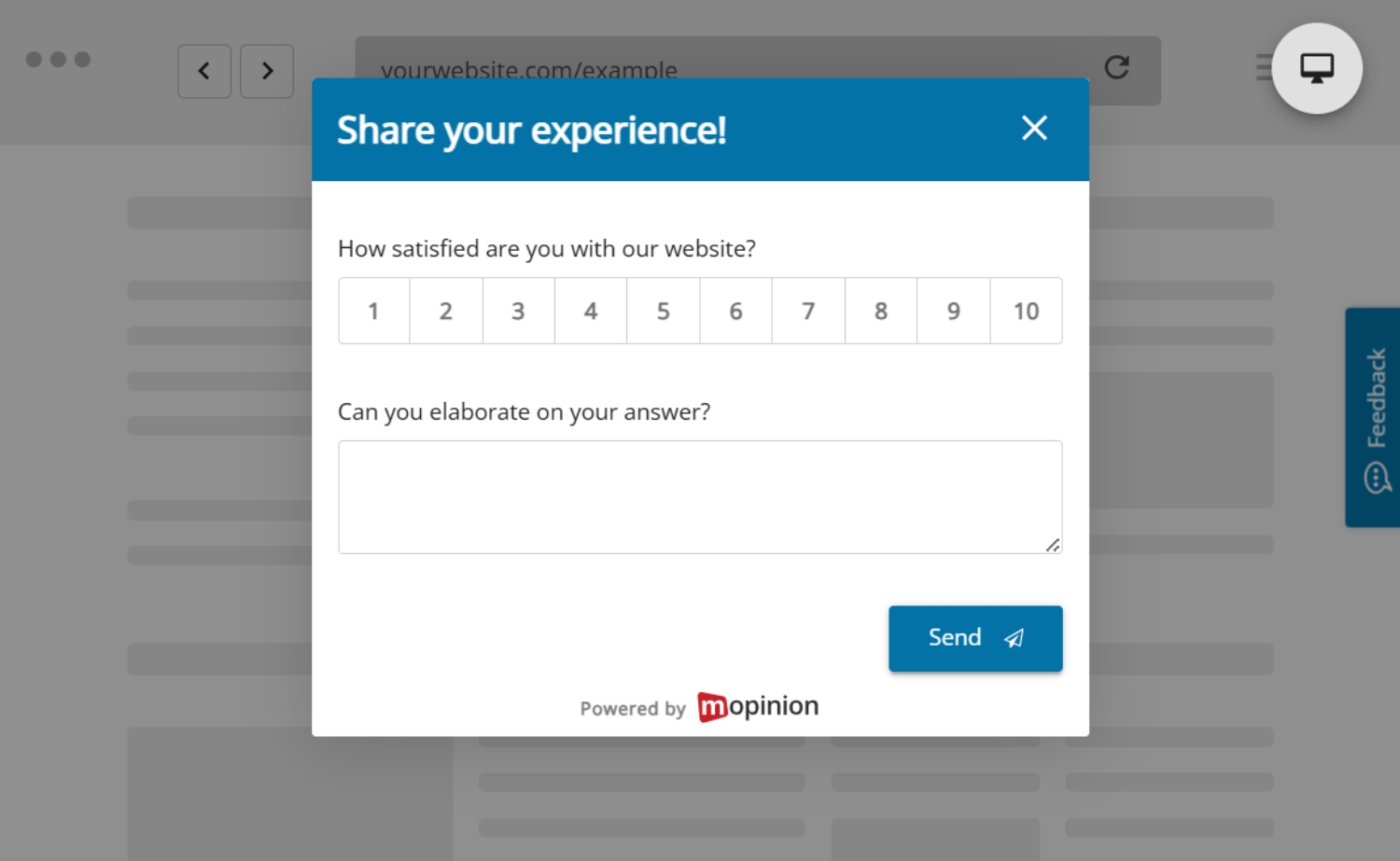
Translation: This image shows a post-purchase CES (Customer Effort Score) form on the KVK website. KVK, short for Kamer van Koophandel, is the Netherlands Chamber of Commerce. After confirming the order, the page asks users to rate the statement “KVK made it easy for me to order a product” on a scale from 1 (strongly disagree) to 7 (strongly agree), to measure how easy the ordering process felt.
Triggered feedback at key moments
Some of the most useful widgets are tied to specific behaviours or conditions. For example:
- after repeated failed searches
- after a visitor spends a long time on one page
- after a transaction or sign-up
- when a visitor reaches an error state
- when a user appears stuck in a form or journey
This kind of targeting makes feedback more relevant. Instead of asking everyone the same thing, you ask the right people at the right moment. That makes it easier to spot the issues that are most likely to affect conversions, satisfaction and retention, especially in high-impact moments where a poor experience could push users away.
How website feedback widgets help identify UX issues
Website feedback widgets give users a direct way to tell you when something feels off. Instead of waiting for complaints to appear through customer support or assuming a dashboard will explain every problem, you create a lightweight feedback channel inside the experience itself.
This is especially useful on high-impact parts of the journey, such as product pages, sign-up flows, support content, pricing pages and checkout. Contentsquare found that long and complicated checkout processes cause over 22% of shoppers to abandon their purchases, showing how quickly unresolved UX issues can affect conversion and retention.
That is exactly why in-the-moment feedback matters. It helps teams understand what users are struggling with while they are still in the experience, making it easier to identify issues such as:
- unclear navigation
- broken or distracting page elements
- weak on-site search results
- missing product or service information
- difficult checkout steps
- confusing forms
- slow or frustrating mobile interactions
The biggest advantage is timing. Because feedback is collected in the moment, it is tied more closely to the actual experience. A visitor can tell you what is confusing while they are on the page, not days later when the detail has already faded.
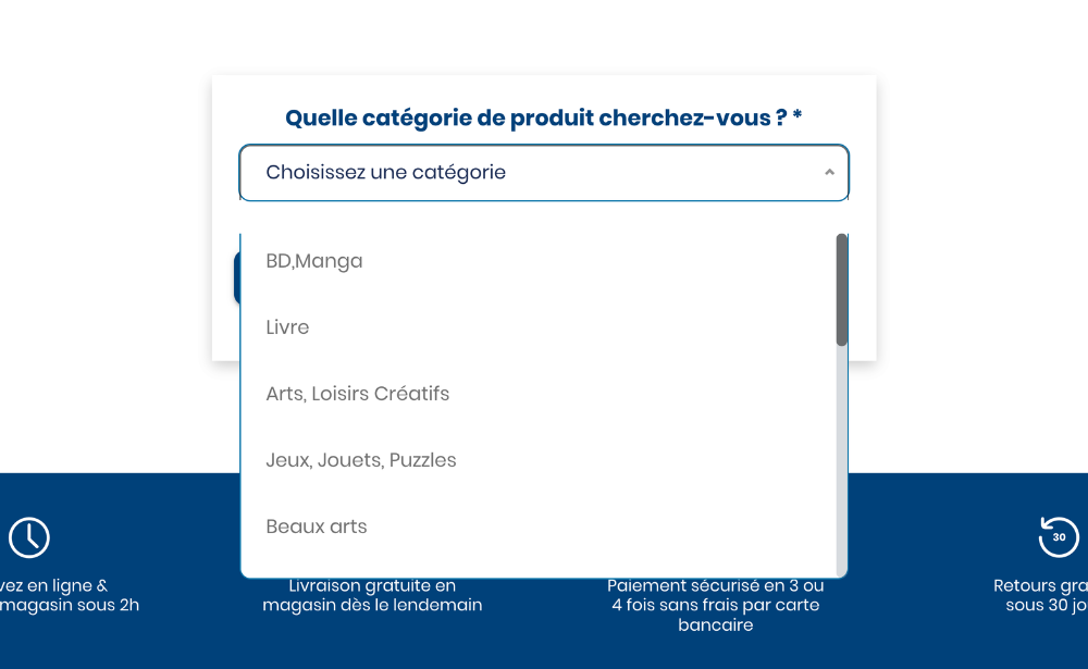
This feedback form from French retailer, Cultura, appears when a visitor is searching for a product with no results, asking what product category the user was looking for
How to implement website feedback widgets effectively
If your goal is to support retention, implementation matters just as much as the widget itself. A poorly placed form that interrupts users or asks vague questions will not give you much value. A well-placed widget with a clear purpose is far more likely to surface actionable insight.
1. Start with a retention-related problem, not a widget
Do not begin by asking, “Where can we place a survey?” Start by asking:
- Where are users dropping off?
- Where do complaints or support tickets cluster?
- Which journeys are underperforming?
- Where do we suspect friction but lack direct evidence?
This keeps the feedback effort tied to a real business and UX problem.
2. Identify the highest-value touchpoints
Focus first on the pages and journeys most likely to affect retention. These often include:
- pricing pages
- onboarding flows
- account creation journeys
- checkout
- support and self-service areas
- product or category pages
- cancellation or downgrade pages
You do not need to cover the whole site at once. Start where the cost of friction is highest.
3. Choose the right widget for the moment
Different questions require different formats. A persistent feedback button is useful for ongoing input. A micro survey is better when you want to validate a specific experience. An exit-intent prompt may help on a known drop-off page. Match the format to the journey stage and user mindset.
4. Ask focused questions
The best feedback questions are usually simple and specific. For example:
- Did you find what you were looking for today?
- What almost stopped you from completing your purchase?
- What information was missing from this page?
- How easy was it to complete this step?
- What could we improve here?
A useful pattern is to combine a scaled question with an open follow-up. For example, if someone gives a low satisfaction score, you can ask what they would improve. That gives you both structure and context.
5. Keep the experience lightweight
The widget should feel easy to ignore when the user is busy and easy to complete when they want to respond. If it is intrusive, repetitive or too long, it will reduce both response quality and trust.
6. Segment where it matters
Not every visitor should see the same feedback request. You may want to target by:
- page type
- device
- traffic source
- user status
- session behaviour
- cart value
- country or language
- whether the user is new or returning
This helps you collect more relevant feedback and avoid over-surveying.
7. Review patterns, not just comments
The goal is not simply to collect quotes. It is to identify themes. Look for repeated mentions of the same issue, page, feature or pain point. When several users describe the same friction in different words, you are usually looking at something worth prioritising.
8. Close the loop with action
Feedback only supports retention if it leads to change. Once patterns appear, teams need to act on them. That might mean:
- rewriting unclear copy
- improving navigation
- fixing broken UI elements
- simplifying forms
- refining search or filtering
- changing where information appears
- optimising mobile layouts
- improving help content
These kinds of changes may seem small on their own, but together they can make the website experience feel clearer, smoother and easier to use. That matters for customer retention because every barrier you remove gives users fewer reasons to drop off, disengage or choose not to return.
This is where digital feedback becomes especially useful. It gives teams a clearer basis for prioritising improvements instead of relying on guesswork alone, helping them focus on the changes that are most likely to improve the experience and support stronger retention over time.
How to use digital feedback widgets without disrupting the user journey
Digital feedback works best when it respects the experience it is trying to improve.
First, avoid asking for feedback too early. Users need enough context to respond meaningfully, so prompting them before they have engaged with the page often leads to weak or unhelpful responses.
Second, do not overload visitors with requests. If every page asks for input, users are more likely to ignore the widgets or become irritated by them.
It is also important to keep the wording neutral. Leading questions make it harder to get honest responses, especially when the real goal is to understand friction or confusion.
Open-text feedback should also have a clear purpose. Rather than asking broad questions you cannot act on, focus on prompts that help the team identify a problem, improve a page or validate a change.
Finally, combine feedback with other signals. Quantitative data, customer support themes, usability testing and session behaviour all add context. Website feedback is most valuable when it becomes part of a wider optimisation process rather than existing in isolation.
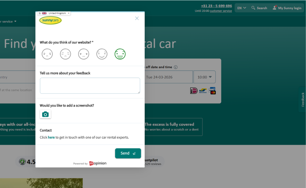
This Sunny Cars website feedback form lets visitors rate their experience with a smiley-based scale, add written feedback, optionally upload a screenshot and contact support, helping the company collect more detailed in-the-moment website feedback.
Turning website feedback into retention improvements
In a highly competitive digital environment, keeping customers often depends on how easy and reliable the online experience feels. If visitors run into confusion, delays or unnecessary effort, they have more reasons to leave and more alternatives to choose from. That is why customer retention is closely tied to ongoing optimisation of the digital journey.
Website feedback widgets support that process by helping teams understand where users are struggling and what needs to improve. Instead of relying only on lagging metrics, businesses can use direct feedback to spot friction earlier and make more informed changes.
A simple workflow often looks like this:
- identify a high-impact journey
- place a relevant feedback widget at the right moment
- collect and review feedback themes
- compare those themes with behavioural data
- prioritise fixes based on impact and frequency
- test improvements
- measure whether the journey performs better afterwards
Over time, this helps teams move from reactive troubleshooting to continuous improvement. Instead of waiting for retention problems to show up in conversion rates, repeat visits or customer churn, they build a system for identifying and resolving experience issues earlier.
That is the real value of website feedback widgets. They help businesses create smoother, more user-friendly experiences over time and that gives customers fewer reasons to disengage and more reasons to come back.
Final thoughts
If you want to improve customer retention, you need more than a view of what users clicked. You need to understand what they experienced while they were on your website.
Website feedback widgets help close that gap. They give users a voice within the digital journey, helping teams identify issues in context and improve the moments that influence whether people stay, return or leave. When used well, digital feedback helps businesses prioritise improvements, validate decisions and create smoother customer experiences over time.
This is where Mopinion, part of Netigate, can help. Mopinion enables businesses to collect targeted website feedback through on-site forms, feedback buttons and in-the-moment surveys across key digital touchpoints. That means teams can capture direct input while users are still in the experience, whether they are struggling with navigation, search, forms, content or checkout. Combined with analysis tools that help teams identify recurring themes and prioritise action, Mopinion gives organisations a clearer way to understand and improve the digital journey. As part of Netigate, it also connects to a broader experience management offering, helping organisations turn digital feedback into longer-term retention improvements.
Retention is not only shaped by what happens after a purchase. It is also shaped by the quality of each digital interaction leading up to it.
Ready to see Mopinion in action?
Want to learn more about Mopinion’s all-in-1 user feedback platform? Don’t be shy and take our software for a spin! Do you prefer it a bit more personal? Just book a demo. One of our feedback pro’s will guide you through the software and answer any questions you may have.