

Website feedback plays a critical role in creating great user experiences and keeping users coming back, because great UX doesn’t happen by accident, it’s the result of continuous listening, learning and improvement.
Research consistently shows how closely UX and retention are linked. According to PwC, 32% of customers will stop engaging with a brand they love after just one bad experience, while Forrester research shows that improving UX can increase customer retention by 5–10%, directly impacting revenue and lifetime value.
This is why we, in this article, will show you 8 practical ways to raise your UX with website feedback!
TL;DR – Article summary
To improve UX and drive higher retention, teams need to understand why users behave the way they do and continuously act on those insights. Website feedback widgets help capture real-time user input at key moments across digital journeys, revealing friction analytics can’t explain. When this feedback is used to prioritise UX improvements, validate changes and align teams, organisations create clearer journeys, reduce frustration and build experiences users want to return to.
Yet many organisations invest heavily in UX design, CRO and analytics. Despite continuous optimisation, users still abandon journeys, encounter friction and leave without converting, often without returning.
Analytics show what users do, but rarely why. To truly understand user experience and improve retention, teams need direct insight into user intent, expectations and frustration and they need to act on those insights continuously across digital journeys.
That’s where website feedback plays a critical role!
In this blog, we’ll cover:
- How do you turn UX improvements into higher user retention?
- Implement website feedback forms to uncover UX friction analytics can’t explain
- Capture user intent with behaviour-triggered feedback
- Understand usability issues through open-text feedback
- Prioritise UX improvements based on real user feedback
- Validate UX changes with continuous feedback
- Improve end-to-end digital journeys with feedback insights
- Align teams around feedback to deliver consistent experiences
- Collect feedback with the help of a feedback widget
- Turning website feedback into better UX and retention
How do you turn UX improvements into higher user retention?
User expectations evolve and experiences that don’t evolve with them quickly lead to disengagement.
Retention improves when UX improvements are treated as an ongoing process rather than one-off projects. Continuous feedback allows teams to track emerging patterns, adapt experiences and proactively prevent recurring frustration.
Over time, this might reveal seasonal spikes in confusion during onboarding or peak periods when many new users arrive. By adjusting guidance and interface cues at these moments, teams create smoother first experiences, increasing the likelihood that users return and continue engaging.
Now let’s get to the tips!
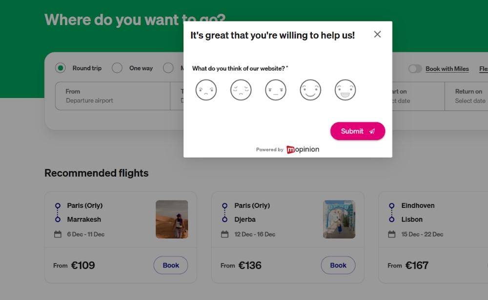
1) Implement website feedback forms to uncover UX friction analytics can’t explain
Analytics are effective at showing where users drop off or hesitate, but they often fail to explain what caused the friction in the first place.
Website feedback forms allow users to share their experience in their own words, directly within the context of the page or journey they’re navigating. Whether triggered by behaviour or displayed at key moments, these forms make it possible to capture insight at the exact moment confusion or frustration occurs.
For example, a product team may notice a high exit rate on a pricing page. While analytics confirm where users leave, a feedback form reveals repeated comments such as “I don’t understand the difference between these plans” or “Is this billed monthly or yearly?”.
By clarifying plan descriptions and pricing logic, uncertainty is removed at a critical decision point. This not only improves usability but also prevents avoidable exits that often result in users never returning.
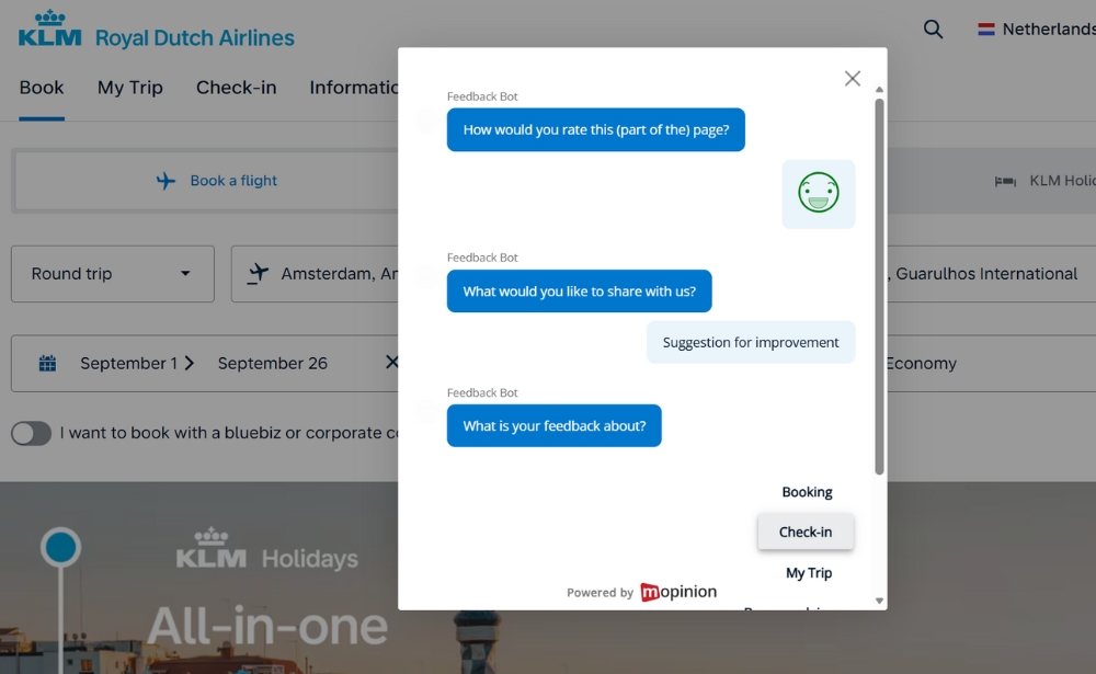
A great example from KLM of how to capture feedback in the moment that helps them optimise customer journeys.
2) Capture user intent with behaviour-triggered feedback
The value of feedback depends heavily on when it is collected.
Behaviour-triggered feedback, such as after hesitation, repeated scrolling or abandonment, captures insights while the experience is still fresh and closely tied to user intent.
In a multi-step signup flow, for example, a feedback prompt appears when users pause or abandon the process. Responses reveal confusion about why certain personal details are required.
By adding short explanations next to these fields, teams reduce hesitation and help users complete the flow, preventing frustration that could otherwise discourage them from returning.
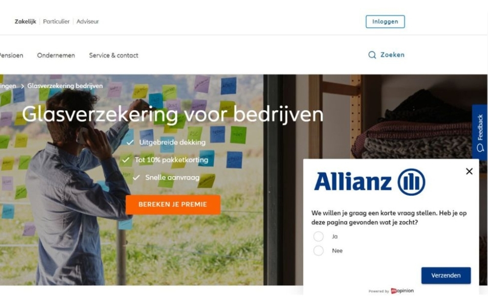
Translation: We would like to ask you a short question. Did you find what you were looking for on this page?
3) Understand usability issues through open-text feedback
Open-text feedback gives users the freedom to explain confusion, expectations or frustration in ways predefined survey options often miss.
It often reveals gaps between how teams design interfaces and how users interpret them.
Common examples include comments like “I clicked here expecting to edit my profile, not view it” or “This button sounds like it deletes everything”.
These insights lead to small but meaningful changes in labels and microcopy. As interactions become clearer and more intuitive, users feel more confident navigating the experience, a key factor in long-term engagement.
4) Prioritise UX improvements based on real user feedback
Not every UX issue has the same impact on satisfaction or retention.
By analysing customer feedback patterns alongside behavioural data, teams can identify which issues affect the largest number of users and create the most friction.
For instance, feedback may consistently highlight difficulty finding help content, while only a handful of users comment on visual preferences.
Prioritising navigation to support resources resolves a widespread pain point, enabling users to self-serve more effectively and reducing frustration that often leads to churn.
5) Validate UX changes with continuous feedback
UX improvements shouldn’t stop once a change goes live.
Continuous feedback makes it possible to validate whether updates actually improve the experience from the user’s perspective, not just in dashboards.
After a checkout redesign, for example, a feedback prompt on the confirmation page collects responses like “This was much easier than before” or “I finally knew what step I was on”.
These responses confirm that friction was reduced, reinforcing quantitative improvements with qualitative validation and building confidence that the experience supports repeat usage.
6) Improve end-to-end digital journeys with feedback insights
UX issues often emerge between touchpoints rather than within individual pages.
Placing feedback at multiple stages of a journey helps teams understand how users experience transitions, continuity and handovers.
A typical pattern might show users feeling confident while browsing products but confused when creating an account. Aligning messaging, design patterns and expectations across these stages creates a more cohesive journey.
Research from Nielsen Norman Group frequently highlights that consistency across interfaces and journeys reduces cognitive load, improves usability and increases user confidence.
7) Align teams around feedback to deliver consistent experiences
Website feedback creates a shared source of truth for understanding user experience across UX, product and marketing teams.
When insights are visible and accessible, teams align around what users actually need, rather than assumptions.
Marketing teams may notice feedback about unclear value propositions, while product teams see comments about feature discoverability. Addressing both together ensures that expectations set before conversion match the experience that follows, strengthening trust and long-term engagement.
8) Collect feedback with the help of a feedback widget
Not all user feedback is tied to a specific moment of friction. Some insights only surface when users are given the freedom to share thoughts in their own time.
A feedback widget, typically displayed as a persistent button on the side of a website or app, allows users to submit feedback whenever something feels unclear, frustrating or unexpectedly positive. Because it’s always accessible, it captures input that behaviour-triggered or page-specific forms might miss.
For example, a returning user may notice small inconsistencies across pages or struggle to find a familiar feature after an update. These issues may not cause immediate drop-off, but over time they erode confidence and satisfaction. A feedback widget gives users an easy way to surface these observations before they turn into disengagement.
By continuously collecting qualitative feedback across journeys, teams gain a broader understanding of how users experience the product over time. This ongoing visibility helps identify recurring friction, monitor sentiment shifts and prioritise UX improvements that support long-term engagement and retention.
Turning website feedback into better UX and retention
Improving UX isn’t about collecting more data. It’s about listening more effectively and acting on what users share.
This is where Mopinion helps teams turn website feedback into structured, actionable insights. By enabling organisations to deploy flexible website feedback widgets, collect real-time user input and analyse qualitative feedback alongside behavioural signals, Mopinion supports a deeper understanding of why users behave the way they do across digital journeys.
When feedback is captured at the right moments and analysed at scale, teams can identify recurring friction, validate UX changes and continuously improve experiences that users actually value. Over time, this leads to clearer journeys, fewer frustrations and stronger trust, all of which play a critical role in driving higher user retention.
By embedding website feedback into everyday UX workflows, organisations move from reacting to issues after users leave to proactively improving experiences that keep users coming back.
Ready to see Mopinion in action?
Want to learn more about Mopinion’s all-in-1 user feedback platform? Don’t be shy and take our software for a spin! Do you prefer it a bit more personal? Just book a demo. One of our feedback pro’s will guide you through the software and answer any questions you may have.