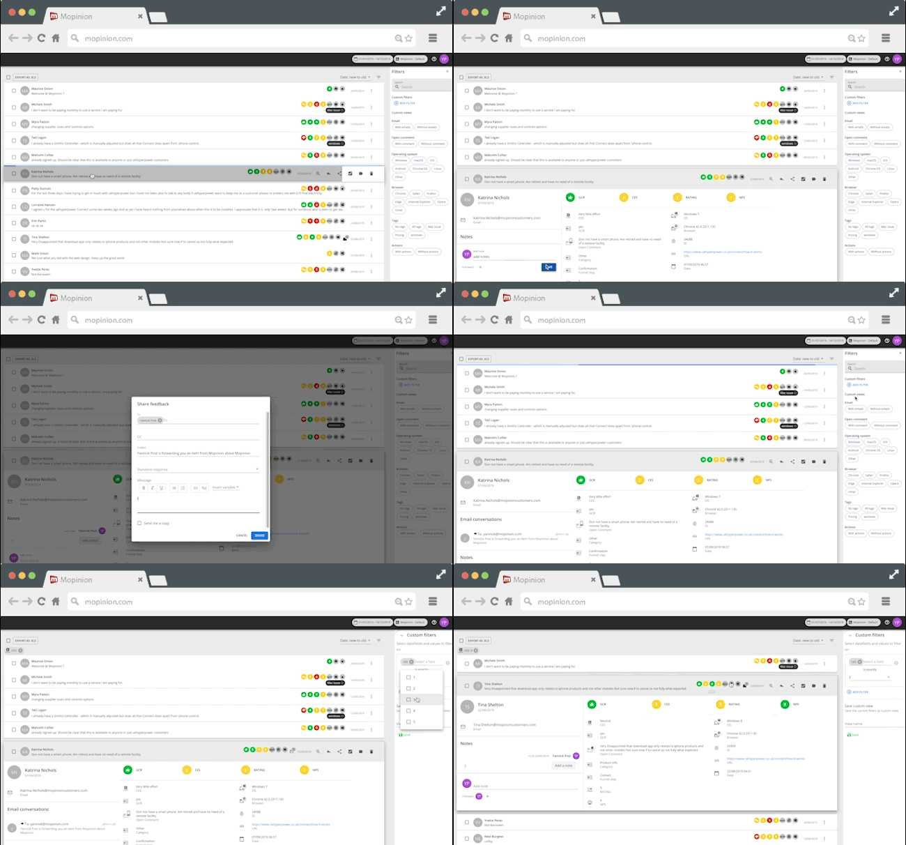
This January the new user interface, Mopinion Raspberry, goes live. In this five-part series, we will ‘unmask’ various new components of the software one by one, components that are guaranteed to give you a smooth and lucid user experience. Unmasking Mopinion Raspberry Part 2 featured the new Feedback Form Builder, but this time we want to focus on another very important part of the platform, the Feedback Inbox.
But before we get started with our next ‘sneak peek’, let us bring you up to speed with what this project actually entails…
What is Mopinion Raspberry?
There have been massive developments in front-end technology over the last few years. Developments which have unleashed new possibilities for delivering a better user experience, allowed for more complex and interesting user interactions, and have increased the scalability of applications. That being said, it was time for Mopinion to evaluate other options and find ways to make our own user interface more scalable and efficient for our users.

After evaluating our options, we decided upon rewriting our application’s front-end code using React, a JavaScript library built by Facebook. A perfect fit for Mopinion, this library allows us to declaratively describe the User Interface using dynamic data and for that interface to change when the data changes.
Anwar Jebali, Senior Web Developer & Front-End Team Lead:
“Based on feedback from customers, qualitative user research and data analysis, we found ways to improve important user flows such as building deployments, navigating the inbox and setting up charts and dashboards. In short, React will enable us to increase the scalability of our app as well as allow us to roll out new features faster and deliver a more consistent experience.”
In this video Anwar gives a short introduction to Mopinion Raspberry.
A Five-Part Introduction Series
This blog series will introduce the five main components of Mopinion Raspberry – the new user interface – identifying the benefits that these new and improved components will bring to the user as well as some teaser footage:
- The Navigation
- The Feedback Form Builder
- The Feedback Inbox
- The Dashboard & Text Analytics
- The Data Explorer & Chart Builder
Now let’s get started with unmasking the Feedback Inbox.

Unmasking the Feedback Inbox
A large amount of incoming feedback can be overwhelming, especially when you’re working with individual items in your feedback inbox. That is why the process of filtering through your feedback should be as simple as possible. With Mopinion’s new user interface, Mopinion Raspberry, it is. Now users can quickly open and act on individual feedback items straight from the inbox, close them back up and move on to the next.
Additionally, the new Feedback Inbox includes:
- Select feedback items in the list and keep them selected as you scroll down the page and view more pages in your inbox, as well apply actions to them via the ‘Selection Toolbar’.
- Easily open/close the detail page of particular feedback items without having to navigate to another page.
- Add and remove tags, share or reply to a feedback item and add actions straight from the inbox.
- Toggle open a feedback item and the redesigned feedback details give you much clearer overview of the relevant data, add notes and assign tasks and then quickly close it back up and start on the next item.
- Apply custom filters to view items matching specific criteria.

Easily flip through individual feedback items
Our new feedback inbox will save you both time and energy when flipping through your feedback items. You no longer have to wait for pages to refresh in order to carry out actions such as notes and assignments. Get your work done quickly and efficiently!
In the coming weeks we will slowly unveil more new and improved components of Mopinion Raspberry, so stay tuned!


