Setting up customer feedback forms that effortlessly blend into your website, mobile app or email campaign is crucial for your response rate. But achieving this is about more than just logos and brand colours (although it’s also about logos and brand colours – we’ll get to that!). You also need to take things like form placement and type, timing, accessibility and much more into consideration. So with that in mind, how do you create a successful digital feedback campaign? Find out in this blog!
In this blog, we’ll deep dive into how to use Mopinion to create a strategic design that feels like a natural part of your customer journey and gets you the most out of your feedback.
We’ll cover:
- How does branding impact feedback form response rates?
- How can you make your feedback forms accessible?
- How do personalisation and smart question logic lead to more relevant feedback?
- What should you think of when choosing a form type?
How does branding impact feedback form response rates?
Did you know that colour can increase brand recognition by 80%?
This is why it’s so important to include your corporate identity in your feedback forms – from colours to logos. If not, you run the risk of your feedback forms looking like something separate from your website, mobile app or email. And trust us, if your target audience thinks your feedback forms are spam or ads, it doesn’t do wonders for your response rate.
How do I change the branding of my feedback forms in Mopinion?
In Mopinion, you can easily edit the look and feel of your feedback form via the ‘DESIGN’ tab in the form builder.
In this video, we show you exactly how you can add your logo and change the colours of your feedback form in Mopinion:
Other feedback form branding tips
But design is, of course, about more than just your colours and logos. These are some handy things to keep in mind when branding your feedback forms:
- Copywriting: Keep your feedback forms in the same tone of voice as the rest of your written content to make them feel like part of your brand. It can be quite jarring to read a blog post in a relaxed tone, only to be met with a super formal feedback form. Or the other way around!
- Short and concise: Keep your forms short and to the point. A study from NIH shows that ultrashort and short surveys (between 2-7 minutes) achieve a whopping 64-65% response rate.
- Clarity: Avoid asking too much in one survey, make it clear what you want to know and formulate your questions to match.
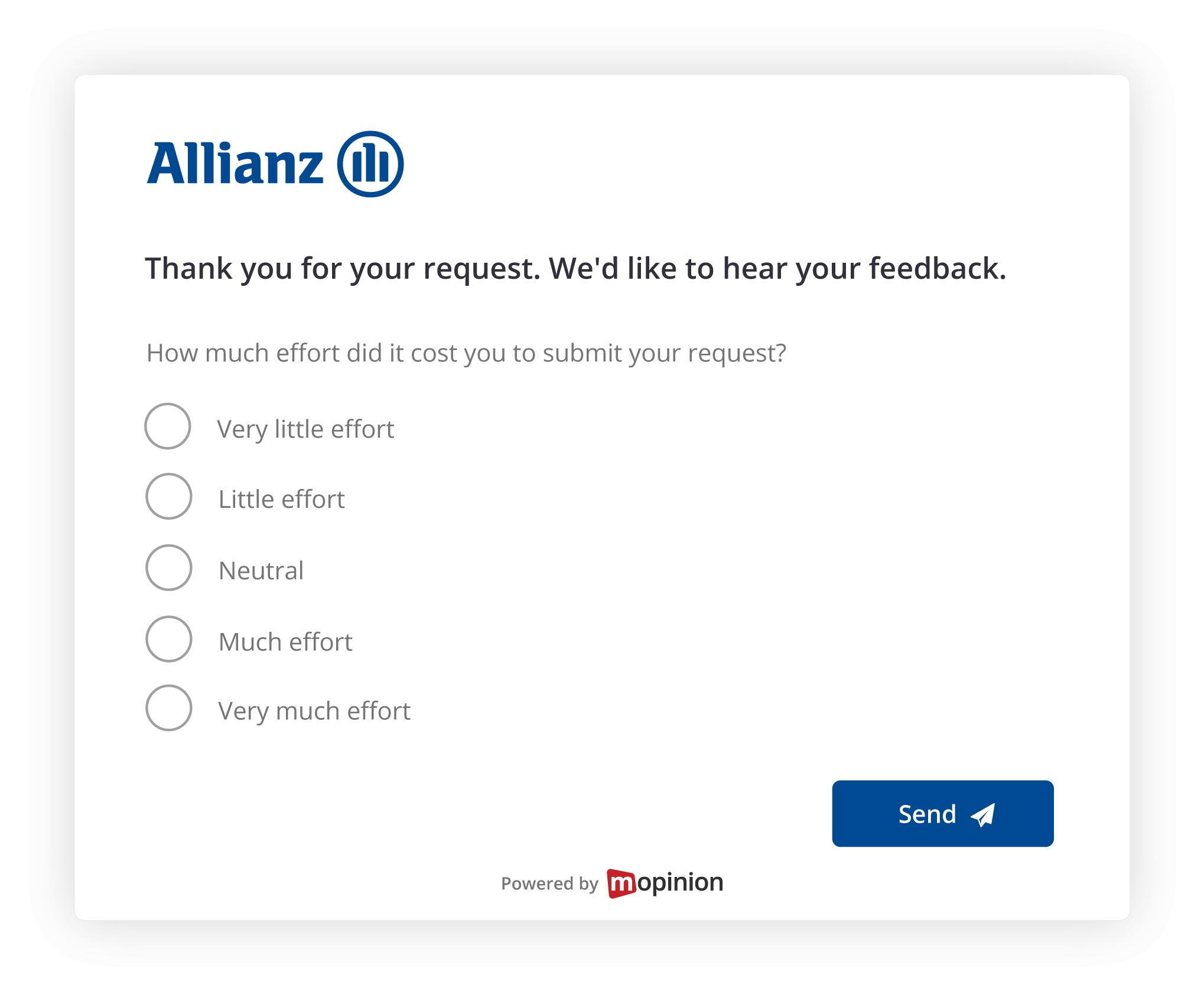
An example of a branded form from Allianz
Unsure what to ask in your feedback forms? Check out our guide to survey questions – complete with 80 examples!
How can you make your feedback forms accessible?
The easiest way to ensure that your feedback forms are accessible is to follow the Web Content Accessibility Guidelines (WCAG). This is a set of guidelines for accommodating people with certain disabilities, like low vision or hearing loss.
Since June 2025, when the European Accessibility Act (EAA) came into effect, all digital content within the EU must follow these guidelines.
As a European company, helping our customers adhere to EU standards is a natural priority for us. That’s why most WCAG settings are automatically applied to your Mopinion forms without you having to do anything at all. This includes support for screen readers, keyboard navigation, alt tags for images, and more.
The only thing you need to manually check is that the colours you’ve chosen for your feedback form have the right amount of contrast. This makes them more visible to people with low vision or colour blindness.
There are online tools to check if the contrast level of your colours complies with the WCAG, one of which is WebAIM. If you wish to get a better understanding of the contrast minimum, the Web Accessibility Initiative also has further documentation to dive into.

Left: non-WCAG compliant form, Right: WCAG compliant form
To give you the option of really branding your feedback forms, you can, of course, still completely customise the look and feel of them. This is true all the way down to the focus indicator, which highlights buttons and elements as users navigate your forms via keyboard.
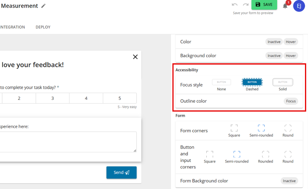
You can find the WCAG customisation option in the ‘Design’ tab of the form builder.
How do personalisation and smart question logic lead to more relevant feedback?
Everyone who uses your website or mobile app might not have insights into the topics you are researching. That’s why implementing personalisation and question logic when you create your feedback forms is so important.
So, what does this mean in practice? Well, it depends on what you are asking.
For example, if you are conducting a Customer Satisfaction survey, an easy version of personalisation is asking the people who give you a high score:
“Fantastic! Is there anything in particular that made your visit to our website especially great?”
While asking the users who give you a low score:
“We’re sorry to hear that. What could we improve to make your experience better?”
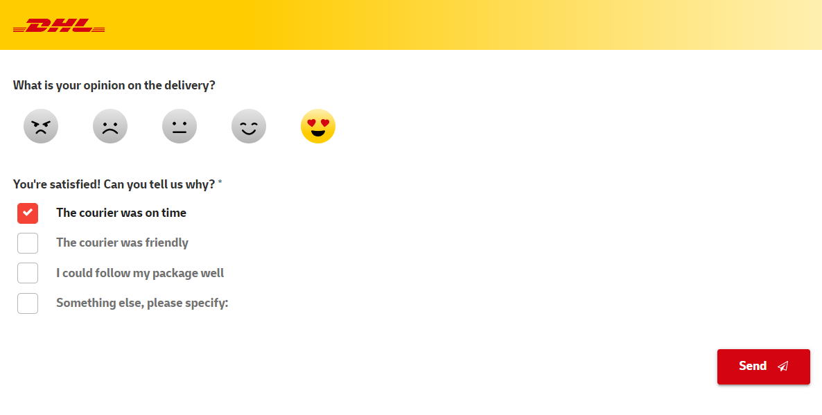
An example of a form with question logic from DHL.
By ensuring that your users get a follow-up question based on what they have answered, you can both get to the improvement points and your USPs, while simultaneously making your target audience feel seen.
Additionally, while it can be helpful to ask both parties how you can improve their experience, you won’t get to specific conversion or customer journey breakers without specifically directing this question to the people who are unsatisfied with their experience on your site/app.
How do I personalise my forms with Mopinion?
When you build your feedback form, go to the tab ‘LOGIC’ and click ‘ADD LOGIC’.
Here you can choose to prefill, show or hide a question based on your users’ answers to a previous question, if a certain cookie has been accepted, if they’ve interacted with a page in a certain way and much more.
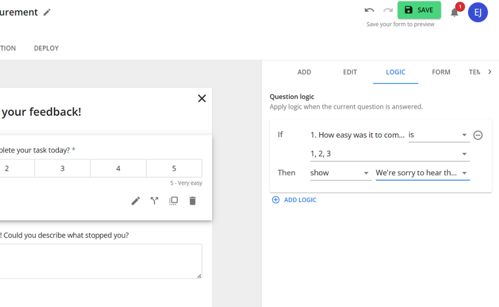
This way, you can deliver a truly personalised feedback experience to all of your users. This leads to:
- Less feedback fatigue – Only relevant questions are shown to all your users
- Relevant feedback – As you’ve asked your questions to the relevant target group, the answers you collect are less diluted, allowing you to get to better insights
What should you think of when choosing a form type?
The most important thing to think of when choosing a form type is the purpose of your form. Based on that, you can decide if you want your form to be discreet, more “in your face” or perhaps baked into a webpage or an email.
With Mopinion, you can choose between three different form types in the form-builder:
- Slide-ins
- Pop-ups (or modals)
- Embedded feedback forms
But when should you use which type? Let’s dive into each version!
Slide-in forms
These are great when you want to gather quick, contextual feedback without disturbing the user’s flow. This also means that they should be very short and to the point.
One of the main benefits of this kind of form is that the simplicity encourages a higher response. They are perfect for a Goal Completion Rate form (triggered by user exit-intent) or for gauging user sentiment when launching a new feature.
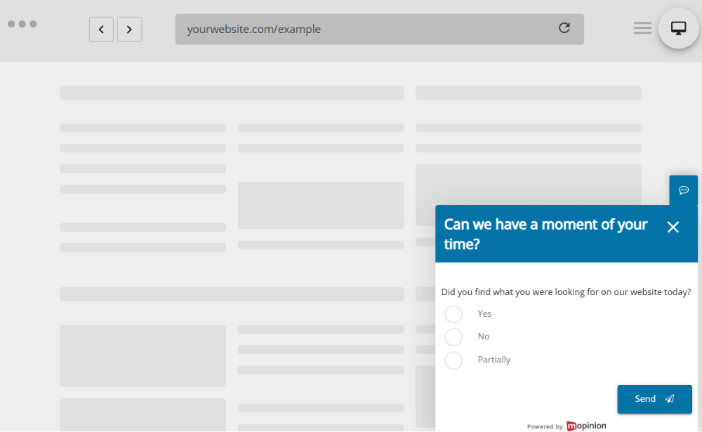
Do not use when:
You are creating a longer feedback form for more nuanced feedback. Then it’s better to opt for a more structured layout – like an embedded form.
Pop-up (modal) forms
In contrast to slide-in forms, pop-up forms should be used when you want to interrupt the user flow to gather further feedback.
This can be helpful when a customer is trying to do something critical, like delete an account or make a payment. The pop-up form then offers an extra step, preventing users from doing something accidental, while also providing you with crucial feedback from high-impact points in the user journey
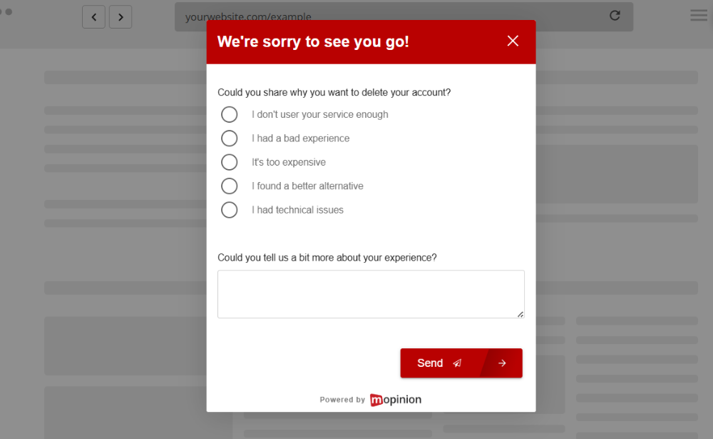
Do not use when:
You require a lot of information. Pop-ups can be quite disruptive, so ensure that they are quick and easy to fill out.
Embedded forms
Embedded forms are great when you want to collect in-context feedback when users are actively engaged with your website, email or product.
They are popular for gauging the usefulness of content-heavy pages or emails, like FAQs, newsletters or blogs. However, these kinds of forms are also a good option for CSAT or NPS post-purchase drip emails.
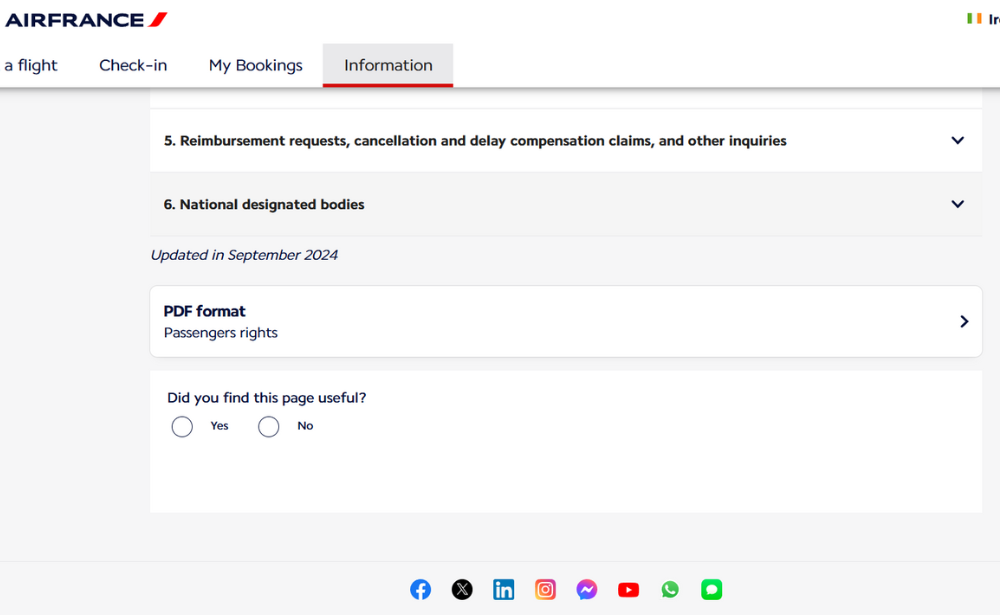
An example of an embedded form from air France.
Do not use when:
It can break the user flow, like in the middle of a check-out. Consider placing your form on the ‘Thank you’ page instead.
And with that, good folks, we’ve reached the end of this very first Feedback Flash edition of our blog. We hope you’ve found it useful. Feel free to drop us some feedback at the end of the page, and let us know how you like it and what you’d like to see more of in these blogs.
Curious about Mopinion?
Are you not yet a Mopinion user but found yourself curious after having read this blog post? Let us tell you a bit about ourselves – Mopinion is the European #1 feedback software for web, app and email. With our solution at your fingertips, you are empowered to easily create cross-channel, digital customer feedback campaigns, collect the data and analyse the results.
To your help, you have smart analysis solutions like automated dashboarding and Smart Recaps, our AI-powered solution for reading and summarising open-feedback comments, at your service. And much more, of course!
Ready to see Mopinion in action?
Want to learn more about Mopinion’s all-in-1 user feedback platform? Don’t be shy and take our software for a spin! Do you prefer it a bit more personal? Just book a demo. One of our feedback pro’s will guide you through the software and answer any questions you may have.


