As feedback analytics experts, we know how important it is to listen to customer feedback so it probably won’t come as a surprise to many of you when we tell you, “We use customer feedback too”! As a result of our most recent feedback, we’ve been able to make quite a few improvements to our software over the past month, including several new features.
Mopinion is really proud to announce the newest Mopinion features and improvements:
- New Inbox Design
- New Action Toolbar
- Tags/Labels Now Available in Chart Builder
- User Experience Improvements in Form Builder
New inbox design
One of the most used pages of our platform, the Mopinion inbox (Reporting/Feedback Results), has undergone a major redesign. This is the page that many of our users work with to browse, search, filter and manage all feedback results.
Earlier this year, many new features were added to the inbox page; a change which ultimately demanded improvements in terms of user experience. In that period, our design team increased the number of filter options, created a search function and added more feedback options (including categorising feedback items with tags and deleting feedback items).
To organise these new functions in a way that is more user-friendly, we have added a large panel to the left-hand side of the screen. In this panel, all of the functions listed above have been included. It will remain visible at all times (as it floats).
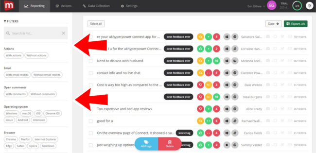
This panel will also include all of the familiar inbox features such as:
- Search function
- Filter to view only feedback with comments
- Filter for browsers and OS
- Filter for added labels/tags
- Filter to view feedback with notes and actions
- Option to add and filter on tags/labels
New Action Toolbar
Mopinion has added a new toolbar dedicated to carrying out important tasks on a page such as, among others, saving, deleting and previewing changes. There is also a ‘help’ option which provides a walk-through explanation of the core elements on the page. It serves as a uniform way of doing something important within the system, whether that is saving changes in a new feedback form or editing charts on your dashboard.

Here are some prominent places where this toolbar is used:
- Form builder
- Dashboard editor
- Chart builder
- Feedback results inbox
- Action management pages
Tags/Labels Now Available in Chart Builder
For some time now, Mopinion users have been able to categorise their feedback by adding tags. This is very similar to adding labels to your email using either Hotmail or Gmail. It is a quick and easy way to sort feedback by topic. For more information on how this works, check out this previous blog post.
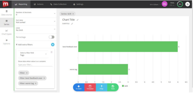
However, now these tags can also be used in your analyses. This capability enables you to easily visualise feedback based on tags and other variables such as scores (e.g. NPS, CSAT, etc). For example, you can select a top 10 chart with the most commonly used tags and base this on the highest CSAT scores.
Another example would be if you use predefined categories in your feedback form, such as compliments, suggestions, bugs. You can create a chart showing which tags have the most bugs. The possibilities here are endless…
UX Improvements in Form Builder
Lastly, Mopinion has made a number of improvements to the Form Builder, including:
- Improved navigation
- More guidance in the flow
- Easier to build a form from scratch
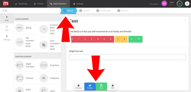
In summation, the steps in which the user must go through are now more prominent with BUILD, DESIGN, CONFIGURE and DEPLOY in the navigation. The user is now also required to go through each of these steps, whereas before they might’ve been skipped over causing the user to miss valuable form elements or design features. Lastly it is much easier to build a form from scratch as there is this extra guidance present with the new floating toolbar element at the bottom of the screen.
What are your thoughts?
As previously mentioned, your feedback is always welcome as we are constantly striving to improve our software to suit the needs of our users. Do you have ideas or suggestions? Please leave them in the comment box below.
Ready to see Mopinion in action?
Want to learn more about Mopinion’s all-in-1 user feedback platform? Don’t be shy and take our software for a spin! Do you prefer it a bit more personal? Just book a demo. One of our feedback pro’s will guide you through the software and answer any questions you may have.


