

Website feedback widgets help you understand what users experience while browsing your website. They give visitors a quick and easy way to share what they think, where they get stuck and what might be stopping them from taking action.
Analytics can show you where users drop off, but feedback explains why. With the right website feedback widget, digital teams can collect in-the-moment insights from key pages and journeys, making it easier to uncover UX issues, improve content and remove conversion blockers.
In this blog, we’ll look at what website feedback widgets are, why they matter for UX and which best practices can help you collect more relevant and actionable feedback.
TL;DR – Article Summary
- Website feedback widgets collect in-the-moment feedback from users while they browse your website.
- They help uncover UX issues, bugs, unclear content, missing information and conversion blockers.
- The most effective widgets are visible, simple, contextual and non-intrusive.
- Placement, timing, targeting and frequency all influence the quality of feedback you collect.
- Short, page-specific questions usually lead to more actionable responses than long, generic surveys.
- Feedback widgets deliver the most value when responses are analysed, shared and used to improve the digital journey.
In this blog, we’ll cover:
- What is a website feedback widget?
- Why website feedback widgets matter for UX
- Types of website feedback widgets
- Website feedback widget UX best practices
- Website feedback widget examples
- Final thoughts
- How Mopinion helps you collect better website feedback
What is a website feedback widget?
A website feedback widget is an on-page feedback tool that allows visitors to share their thoughts, problems or suggestions while browsing a website. It usually appears as a small button, tab, pop-up, embedded form or feedback icon.
Unlike traditional surveys, website feedback widgets are often connected to a specific page, journey or user behaviour. This makes the feedback more contextual and easier to act on.
For example, a visitor might use a feedback widget to:
- Report a broken link
- Explain why they could not complete a form
- Share that a page is missing important information
- Rate how useful a help article was
- Tell you why they are leaving a checkout journey
- Highlight a technical or visual issue on the page
This type of feedback is useful because it captures the user’s experience while it is still fresh. Instead of asking customers to remember an issue later, you give them the option to share feedback in the moment.
Why website feedback widgets matter for UX
User experience is not only about how a website looks. It is about how easy, clear and useful the experience is for the people using it.
A website can look polished and still create frustration. Users may struggle to find information, misunderstand a button, feel unsure about pricing or abandon a form because it asks for too much information. These issues are not always easy to spot from analytics alone.
This is where website feedback widgets add value. Analytics can show you what users are doing, but feedback helps explain why they are doing it. This is also why timing and context matter. Nielsen Norman Group recommends asking for feedback after users have had the chance to complete a real task, rather than interrupting them too early in the journey.
For example, analytics might show that a product page has a high exit rate. Feedback from that page might reveal that users are leaving because delivery information is unclear. Similarly, a form might have a low completion rate, but user feedback might show that people are unsure why certain personal details are being requested.
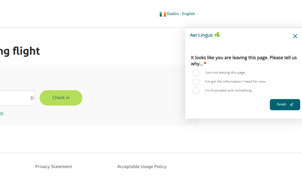
Aer Lingus, our customer and a well-known flag carrier airline of Ireland, collects exit feedback to understand why visitors are leaving a page and what may be missing from the digital journey.
This makes feedback widgets useful for several teams across the organisation. UX teams can use widget feedback to improve journeys and layouts. Product teams can use it to detect bugs or feature issues. Marketing teams can use it to optimise landing pages and messaging. Customer service teams can use it to identify recurring questions before they become support tickets.
In other words, website feedback widgets help connect behavioural data with human context. That context is what helps teams prioritise the right improvements.
Types of website feedback widgets
There are several types of website feedback widgets. The right one depends on what you want to learn and where you want to collect feedback.These different website feedback types can help teams collect everything from general page feedback to more specific visual or journey-based insights.
Before choosing a widget type, think about your feedback goal. Are you trying to collect general website feedback, understand a specific conversion blocker, improve support content or identify technical issues?
Passive feedback widget
A passive feedback widget is always available on the website, usually as a small tab, button or icon. Users can click it whenever they want to share feedback.
This type of widget is useful because it does not interrupt the browsing experience. It gives users control over when they want to respond.
Passive feedback widgets work well for:
- General website feedback
- Bug reports
- Content suggestions
- Navigation issues
- Page-level feedback
- Unexpected user frustrations
For example, a “Give feedback” button on the side of a webpage allows visitors to report an issue as soon as they notice it.
Triggered feedback widgets
A triggered feedback widget appears based on specific user behaviour. For example, it might appear after a visitor spends time on a page, scrolls to a certain point, completes an action or shows exit intent.
Triggered widgets are useful when you want feedback at a specific moment in the journey.
For example, you could trigger a feedback widget:
- After a purchase is completed
- When someone is about to leave a page
- After a visitor reads a help article
- When someone spends a long time on a pricing page
- After a user abandons a form or funnel
The key is to make the trigger relevant. A widget that appears too early or too often can feel disruptive.

Tommy Hilfiger, our customer and a global fashion and lifestyle brand, collects technical feedback to help identify website issues that may affect the online shopping experience.
Embedded feedback forms
Embedded website feedback forms are placed directly within the page content. They are often used on help centre articles, blog posts, landing pages and support pages.
A common example is a short question at the end of an article, such as:
“Was this article helpful?”
This type of feedback widget works well because it is directly connected to the content the user has just viewed. It helps you understand whether the page answered the user’s question.
Visual feedback widgets
Visual feedback widgets allow users to give feedback on a specific part of the page. They may include screenshots, annotations or click-to-comment functionality.
This is especially useful for UX, product and development teams because it provides extra context. Instead of simply saying “this button does not work”, the user can show exactly where the issue is.
Visual feedback widgets are helpful for:
- Bug reporting
- Design issues
- Mobile layout problems
- Broken elements
- Confusing page sections
- Technical feedback
For complex websites, visual feedback can make it much easier to understand and resolve user issues.
Website feedback widget UX best practices
A good feedback widget should make it easier for users to share feedback, not harder. Here are the most important UX best practices to keep in mind.
1. Make the widget visible, but not intrusive
Your feedback widget should be easy to find, but it should not distract users from what they came to do.
A small button, tab or icon is usually enough. It should be visible on the page, but not so dominant that it competes with important content, calls-to-action or navigation.
For example, a feedback tab on the side of the page can stay accessible without blocking the user’s journey. This gives visitors the option to share feedback when they need to, without forcing them to interact with it.
Avoid using large overlays or aggressive pop-ups unless there is a clear reason for them. The best website feedback widgets feel available, not pushy.
2. Keep the form short and focused
Most website visitors are not planning to complete a long survey. If they choose to leave feedback, they usually want to do it quickly.
That is why short forms often work best. Ask only for the information you truly need. This also aligns with Nielsen Norman Group’s EAS framework for simplifying forms, which recommends reducing user effort by eliminating unnecessary questions, automating where possible and simplifying what remains.
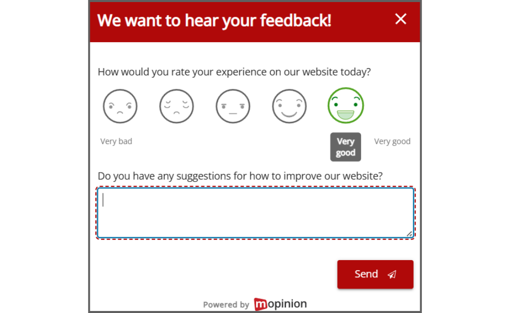
A simple website feedback widget might include a rating question, one open comment field, an optional email field and a feedback category, such as bug, suggestion or complaint.
For example:
“How would you rate this page?”
“What could we improve?”
“Leave your email if you would like us to follow up.”
This gives your team enough information to understand the issue without overwhelming the user.
3. Ask contextual questions
Generic questions can be useful, but contextual questions are often more actionable. Choosing the right website feedback questions helps users understand what kind of input you are looking for and makes the responses easier to act on.
Instead of asking the same question on every page, tailor your feedback widget to the user’s journey.
For example:
- On a homepage: “Were you able to find what you were looking for?”
- On a pricing page: “Is our pricing information clear?”
- On a checkout page: “What stopped you from completing your order?”
- On a help article: “Was this article helpful?”
Contextual questions make feedback easier to give and easier to interpret. They also help you connect responses to specific improvement opportunities.
4. Choose the right moment to ask for feedback
Timing has a big impact on the user experience. A feedback widget shown at the wrong moment can create friction, especially when users are trying to complete an important task.
For example, asking for feedback while someone is filling in a payment form can interrupt the conversion journey. Asking too early, before someone has had time to experience the page, may also lead to vague responses.
Good moments to collect feedback include after a user completes a task, at the end of a content page, when a user shows exit intent or after a journey has been abandoned.
The goal is to ask when the user has enough context to give a useful answer, without getting in the way.
5. Use simple and human language
Your website feedback widget should be easy to understand at a glance. Avoid complex wording, technical language or long explanations.
Instead of saying:
“Submit your digital experience evaluation.”
Say:
“Give feedback.”
Instead of asking:
“How would you assess the informational quality of this webpage?”
Ask:
“Was this page helpful?”
Clear language makes it easier for users to respond. It also makes the widget feel more natural and approachable.
6. Make the widget mobile-friendly
A feedback widget that works well on desktop may not work well on mobile.
On smaller screens, widgets can easily block content, overlap buttons or become difficult to close. Accessibility is also important here. W3C’s WCAG 2.2 guidance on target size explains that clickable targets should be large enough and spaced well enough to reduce accidental taps.
To make your website feedback widget mobile-friendly, make sure it:
- Does not cover important content
- Is easy to tap
- Has a clear close button
- Uses short questions
- Works across different screen sizes
- Does not interfere with navigation or checkout buttons
It is also worth reviewing how the widget affects the wider page experience. Google’s Core Web Vitals guidance highlights loading performance, interactivity and visual stability as important signals of a good web experience, so feedback widgets should not slow pages down, delay interactions or cause unexpected layout shifts.

Allianz, our customer and a global insurance and financial services provider, collects short on-page feedback to understand whether visitors found what they were looking for.
Translation of the feedback form:
“We would like to ask you a few short questions. Did you find on this page what you were looking for?”, “Yes or No”
7. Use targeting and frequency rules
Not every visitor needs to see the same feedback widget. Targeting allows you to show the right question to the right user at the right time.
You can target website feedback widgets based on page URL, device type, traffic source, time on page, scroll depth, exit intent, new or returning visitors, customer segment or completed actions.
For example, a first-time visitor on your homepage may need a different feedback question than a returning customer on your pricing page.
Frequency also matters. Even a well-designed feedback widget can become annoying if it appears too often. To avoid feedback fatigue, use frequency settings and targeting rules. For example, you might choose to show a triggered widget only once per session or only after a user has completed a specific action.
The aim is not to ask more often, but to ask better.
Website feedback widget examples
Here are a few practical examples of how website feedback widgets can be used across different digital journeys.
Example 1: Content feedback widget
A company adds a feedback widget to its help centre articles asking:
“Was this article helpful?”
If a user selects “No”, the widget asks:
“What information were you looking for?”
This helps the content team identify missing answers and improve support content over time.
Example 2: Pricing page feedback widget
A SaaS company adds a feedback widget to its pricing page asking:
“Is our pricing information clear?”
Users can leave comments explaining what is confusing or missing. If multiple users mention the same issue, the team can update the pricing page with clearer plan comparisons, additional FAQs or more transparent package information.
Example 3: Checkout feedback widget
An e-commerce company uses an exit-intent feedback widget when users are about to leave the checkout page.
The widget asks:
“What stopped you from completing your order?”
Responses might reveal issues such as unexpected delivery costs, unclear payment options or a lack of trust signals. This is especially relevant for ecommerce journeys, where Baymard Institute’s checkout research shows that around 70% of ecommerce visitors abandon their shopping cart.
The ecommerce team can then use these insights to improve the checkout journey.
Final thoughts
A website feedback widget is not just a small button on a page. It is a direct line to the people experiencing your website in real time.
When designed well, website feedback widgets help teams move beyond assumptions. They show what users need, where they struggle and which improvements could have the biggest impact.
The best widgets are visible without being intrusive, short without being vague and targeted without becoming annoying. Most importantly, they help turn user feedback into a continuous source of insight for improving the digital experience.
How Mopinion helps you collect better website feedback
Mopinion, part of Netigate, helps digital teams collect, analyse and act on website feedback across the full online journey.
With Mopinion, you can create targeted website feedback widgets for different pages, audiences and behaviours. This helps you ask the right questions at the right moment, whether you want to collect general website feedback, measure page satisfaction, capture visual feedback or understand why users abandon a journey.
Teams can use passive and triggered feedback forms, add contextual questions to specific pages and collect both quantitative and qualitative feedback in one place. This makes it easier to combine scores, ratings and open comments to understand not only how a page is performing, but also why users feel the way they do.
By bringing website feedback together in one platform, Mopinion helps organisations move from individual comments to actionable insights. Teams can share feedback across departments, prioritise improvements and create better digital experiences based on real user input.
FAQs about website feedback widgets
Frequently Asked Questions
A website feedback widget is an on-page tool that lets visitors share feedback while they browse your website. It can appear as a small button, tab, pop-up, embedded form or feedback icon, helping teams collect comments about UX issues, unclear content, bugs or missing information in the moment.
Website feedback widgets are important for UX because they help explain what users are experiencing on specific pages or journeys. Analytics can show where users drop off, but feedback helps explain why they are confused, frustrated or unable to complete a task.
The main types of website feedback widgets are passive feedback widgets, triggered feedback widgets, embedded feedback forms and visual feedback widgets. Each type supports a different goal, from collecting general page feedback to understanding exit intent, improving support content or identifying technical issues.
A website feedback widget should be placed where it is easy to find but does not interrupt the user journey. Common placements include a small side tab, a button near the bottom of the page, an embedded form at the end of an article or a triggered widget shown after a relevant user action.
The best website feedback widgets are visible, short, contextual and non-intrusive. They should use simple language, work well on mobile, appear at the right moment and ask questions that match the page or journey the user is experiencing.
Website feedback widgets can improve conversions by helping teams understand what stops users from taking action. Feedback may reveal issues such as unclear pricing, missing information, confusing forms, unexpected costs or technical problems, which teams can then fix to create a smoother journey.
Ready to see Mopinion in action?
Want to learn more about Mopinion’s all-in-1 user feedback platform? Don’t be shy and take our software for a spin! Do you prefer it a bit more personal? Just book a demo. One of our feedback pro’s will guide you through the software and answer any questions you may have.