UX design is all about providing your users with the information they’re looking for, and doing so in the cleanest and most intuitive way possible. However, in order to do this successfully, UX designers must understand how their visitors experience the website or mobile app; a task which can get a little sticky if they don’t have the right tools in place. Luckily, there is one tool in particular that is considered an extremely important currency when it comes to UX design. Let us introduce you to user feedback…
User feedback is the key indicator of user experience performance. Having access to customer insights puts you as a UX Designer at a competitive advantage. In fact, user feedback will also enable you to prioritise and address issues that surface, putting you one step closer to reaching a profitable conclusion and closing the loop. And according to a study carried out by Deloitte and Touche, “customer-centric companies are 60% more profitable than those not focused on the customer“.
So why would you want to lose out on these profits?
Three reasons UX Designers need User Feedback
In this article, we have identified three reasons why UX designers need to be collecting and analysing user feedback. Here they are:
1. Easily uncover bugs and page errors in the blink of an eye
That’s right, sometimes the devil is in the details. Bugs and page errors can be a major source of irritation for your users, meaning the sooner you remove (or minimise) these from the equation, the better off you’ll be. With visual feedback, your users can submit screenshots or highlight the location of a bug alongside critical metadata such as browser type, OS, window size, or screen size. This input will give you the resources you need to determine the origin of the bug or error, reproduce it and rectify it on the spot.

Source: Transavia
2. Make improvements on digital content & website design
Poor digital content can confuse, alienate, or even offend your customers. In fact, poor content often translates to a poor user experience. And the quality of the content depends a lot on where it’s placed. For example, a product feature page can be really critical for conversions. If you lack clear, quality imagery/videos, or those images are slow to load, you’re undoubtedly going to struggle with conversions.

Screenshot added to feedback form
There are a couple of ways to gather this type of feedback including embedded user experience survey forms (on text-filled pages such as FAQs or instructions), proactive triggers (once a visitor has scrolled to the bottom of the page), and visual feedback.
Looking for more tips on how to enhance your digital content with feedback? Check out this post.
And then there’s website design. Poor website design is an easy way to lose touch with your customers. For example, if your website is difficult to navigate, or if a certain button isn’t ‘clickable’ or visible within the checkout process, your customers are bound to drop off.

Source: Web Dawg
User feedback will give you insights into where your design falls short. You can collect this feedback by way of a generic page rating form (see feedback form template #5) as this will help you capture feedback from visitors who come across poor usability on any given page of your website. Having this feedback button always visible makes it easy for your users to submit their feedback.

Free White Paper: The future of Online Customer Feedback
Learn how you can leverage the power of online customer feedback to optimise websites and apps.
3. Create strong hypotheses for A/B testing
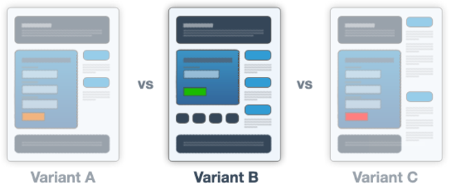
Lastly, user feedback can enhance your A/B testing efforts. If you think long and hard about it, carrying out an A/B test on your website or mobile app (without prior insights gained from user feedback) is actually just you testing your own assumptions. Odds are you are using a hypothesis that is probably based on what you think will solve your customers’ problems. While this method may work for some businesses, it isn’t exactly efficient and can really limit your optimisation efforts.

Source: Unbounce
If you throw user feedback into the equation, however, you will be in a much better position to make an informed decision about what your hypothesis should be. This is because you are combining qualitative data with quantitative data. It will help you identify areas of struggle that you haven’t previously recognised with other analytics tools.
Want to learn more about the relationship between feedback and A/B testing? Check out this post!
So what’s the common theme here?
Visual feedback, also referred to as usability feedback (or UX feedback) is one of the key types of feedback used by UX designers. This type of user feedback serves as a great aid in improving page usability by capturing visual input from users in real-time. More specifically, your users can point to specific page elements (including forms, images, buttons or paragraphs) and provide feedback on those page elements.
Improve your UX design with User Feedback…
Mopinion is the #1 feedback software for web, app and email. This software allows UX Designers to work with visual feedback in a way that provides deep insights into the online customer experience, especially when visitor volumes and the complexity of a website increase. With the Mopinion solution and the various options offered for collecting and analysing this type of feedback, users can quickly reveal any issues on different webpages in real-time, whether that’s poor or unclear website content, bugs, or browser issues.
Ready to see Mopinion in action?
Want to learn more about Mopinion’s all-in-1 user feedback platform? Don’t be shy and take our software for a spin! Do you prefer it a bit more personal? Just book a demo. One of our feedback pro’s will guide you through the software and answer any questions you may have.


