We are pleased to announce that today Mopinion’s new user interface Mopinion Raspberry was successfully (beta) launched. This next generation user interface not only ties together all of the same, favourite functionalities of its precursor, but will also enable our users to conveniently collect and manage their feedback in a more effortless manner.
Anwar Jebali, Senior Web Developer & Front-End Team Lead:
For years now, Mopinion has been continuously collecting feedback from its users, carrying out extensive qualitative research and data analysis, and Mopinion Raspberry is essentially a culmination of those efforts. In other words, it’s not only designed with customers in mind, but in some ways our customers designed it themselves. With this new user interface, we’ve reimagined and improved all important workflows with the goal of making feedback easier to both process and analyse.
In this post, we will tell you more about:
- How to Switch Over to Mopinion Raspberry
- Effects of switching to the new UI
- The Improvements to the UI
- How to Provide your Feedback
How to switch over to Mopinion Raspberry
Because this is a beta launch, your account will not be automatically switched over to the new user interface. If you wish to try out the new environment, you can switch your account manually via the menu at the top right of the screen.

Click on ‘Switch to Raspberry’.

Want to switch back to the old environment? Go for it. Just head to the menu again at the top right of your screen.
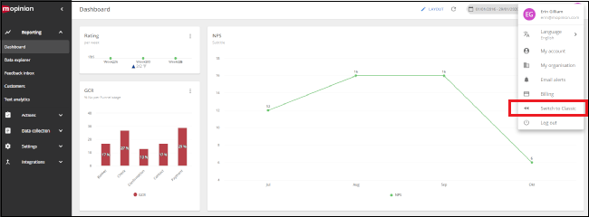
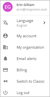
Click on ‘Switch to Classic’.
What are the effects of switching to the new UI?
There are none! The user interface is what is called ‘backwards compatible’, meaning our system offers interoperability with the classic UI. All of your settings (i.e. feedback forms, tagging, dashboards) will remain the same in Mopinion Raspberry. As for your feedback data itself, this is managed using a standalone web service, meaning the new UI will not have any effect on existing feedback data or the feedback collection process.
Improvements across the entire UI
Redesigned with your needs in mind, we’ve introduced a more simplified workflow as well as optimised all existing functionalities, (such as the Navigation, Form builder, Feedback inbox, Dashboard and the Data Explorer) making it easier for you to reach your goals and enjoy a more consistent user experience.
The Navigation
The optimisation of the navigation (i.e. menus and configuration pages) is one of the most fundamental changes to the software. The navigation was redesigned using a more logical and accessible approach, so as not to interrupt the user experience.
The Feedback Form Builder
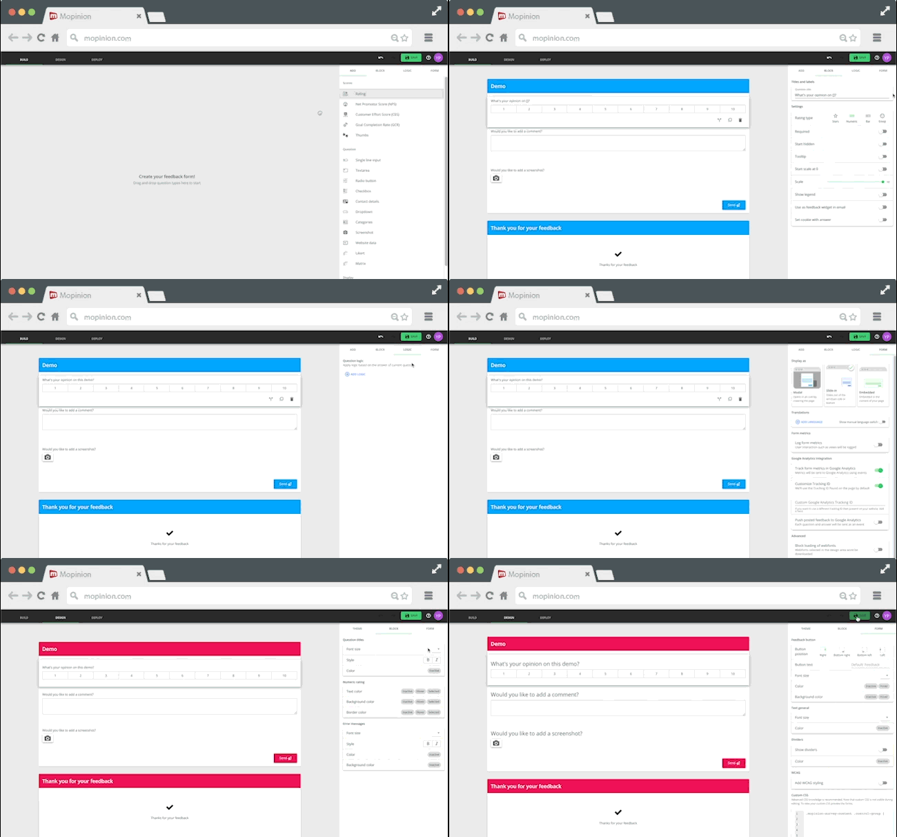
The process for creating feedback surveys has been optimised with a drag-and-drop editor, built-in editing menu and live preview of the form being built, making it more interactive and intuitive.
The Feedback Inbox
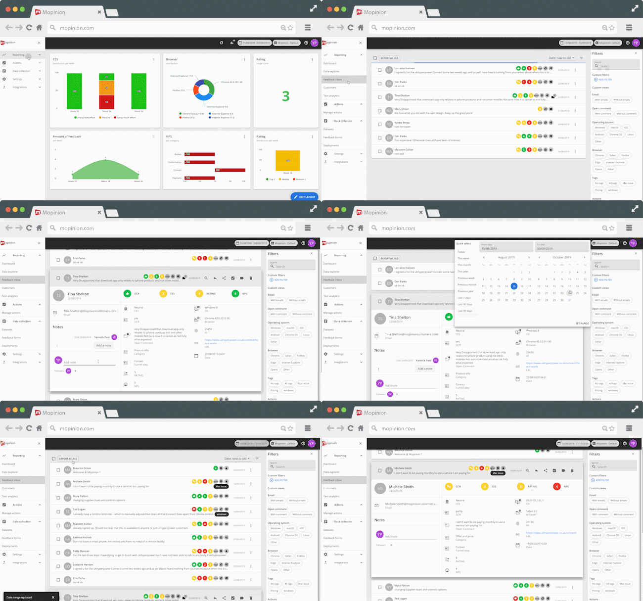
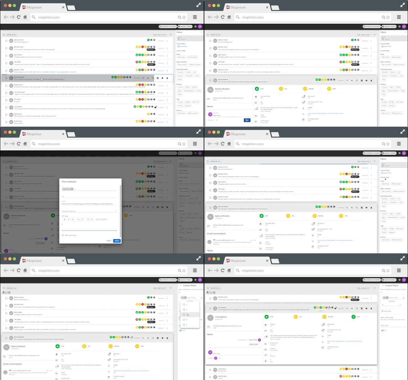
In terms of analysis, the inbox used to browse through feedback responses has been enhanced so that users can view individual items in a more digestible manner (with the application of easy-to-use pull downs to feedback detail pages).
Dashboard & Text Analytics
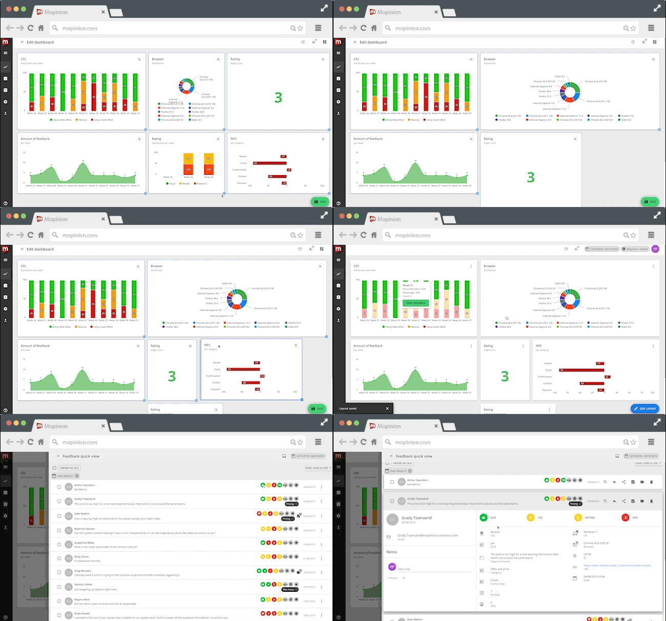
The process for building a feedback dashboard is now even more customisable, with the new ability to select the size and shape of each chart as well as determine specifically where the charts will be placed.
Data Explorer & Chart Builder
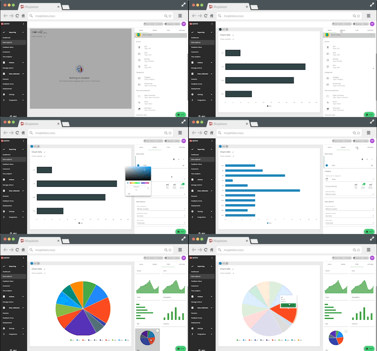
Lastly, users now have a fun and easy way of identifying trends and comparing feedback data data via a new feature called the Data Explorer, which makes it possible to compare sets of data and results in one data visualisation without changing or adding it to the overall dashboard.
Find out what’s new here.
Anwar continues,
“In Mopinion Raspberry your feedback is accessible and actionable in all relevant places. We kept the good parts of our platform and optimised most of the workflows. The net result for our users will be a smoother experience; less time spent navigating the platform and more time spent analysing and working with feedback. Looking to the future Mopinion Raspberry will allow users to carry out more complex tasks (such as in-depth feedback analyses in charts) and as a result, further increase user connectivity.”
Help us improve the new UI and send us your feedback!
As we mentioned, this is a beta release so we know it’s not perfect. Therefore, we’d be grateful for any feedback you might have regarding the user experience, functionality and of course, overall satisfaction with Mopinion Raspberry!
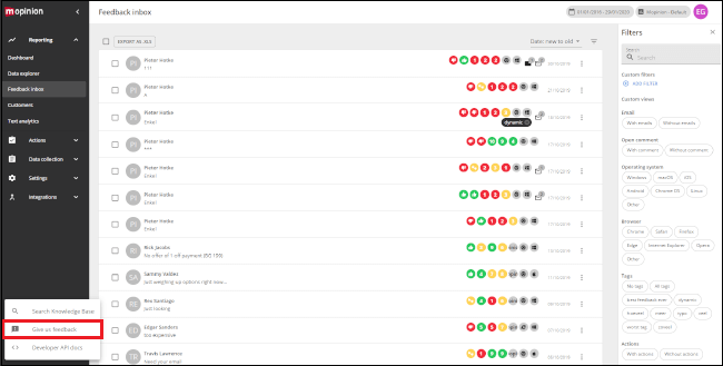
Just head to the bottom left corner of the page and click on the ‘?’ button. Here you can select ‘Give us feedback’.
Ready to see Mopinion in action?
Want to learn more about Mopinion’s all-in-1 user feedback platform? Don’t be shy and take our software for a spin! Do you prefer it a bit more personal? Just book a demo. One of our feedback pro’s will guide you through the software and answer any questions you may have.


