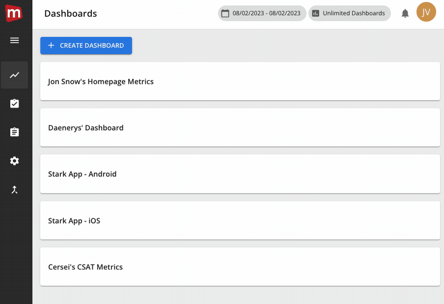
At Mopinion, we understand the importance of making data accessible to everyone who needs it. That’s why we were beyond excited to announce the introduction of unlimited dashboards. This allows multiple users and teams within an organisation to create as many dashboards as they need to support their data analysis and decision-making. To ensure that you get the most out of this feature, we have put together a comprehensive guide full of tips and tricks for setting up your dashboards for success. Whether you are a beginner or an experienced data analyst, these tips will help you to create effective and informative dashboards that meet your unique needs.
Unlimited data analysis
With unlimited dashboards, everyone in your organisation can have access to the data they need to drive insights, improve processes, and make better decisions. Following the release of access groups, our advanced user management system, unlimited dashboards allows you and your team to create multiple dashboards per report.
This means you can combine and compare data from different forms in the same report to get a holistic view of customer feedback across multiple channels. For example, if you have different mobile apps for different products, combining the data from these forms can help you identify common themes that are affecting your customers across different channels. This can help you prioritize improvements and allocate resources more effectively.
Unlimited dashboard offers a variety of different charts that can be helpful for achieving specific goals such as:
- Charts over time: These charts are helpful for tracking changes and trends over time. For instance, if you’re monitoring customer satisfaction, a chart showing satisfaction levels over the past few months can help you identify whether satisfaction is increasing, decreasing, or remaining steady.
- Number of items: Charts that display the number of items, such as the number of website feedback or the number of sales feedback, can be helpful for monitoring overall activity and identifying changes in volume. These charts can help you identify whether there are spikes or dips in activity, and allow you to investigate further to determine the cause.
- Comparison charts: Comparison charts are useful for comparing two or more variables to see how they relate to each other. For instance, a chart comparing the number of post-purchase feedback responses with the number of landing page feedback responses can help you determine whether there is a correlation between these two variables.
By selecting the appropriate chart for your specific goals, you can easily monitor changes over time, track activity, and identify relationships between different variables.
In large enterprises with multiple teams, divisions, roles, and countries, we understand the need for more options when it comes to analysing feedback to drive decision-making. To give you an idea of the opportunities, we listed some best practices for unlimited dashboards below.
Let’s dive in.

Personal dashboards
To get started with unlimited dashboards, we recommend creating your own, ‘personal’ dashboard. This way, you can tailor your data analysis to your specific needs and preferences. Choose the charts and data sets that are most relevant to your work every day and focus on the insights that matter to you. The handiest thing about unlimited dashboards is that now you can duplicate charts from different dashboards within the same report. Easily duplicate charts relevant to your role, and since you have unlimited dashboards, feel free to create test dashboards and copy charts from there.
By having control over the data that is displayed, you can easily identify trends and patterns in your feedback data. No need to clutter your dashboards, have your key, relevant charts visible in your personal dashboard. You can also explore this data in depth to uncover new insights that may have otherwise gone unnoticed.

Goal-based dashboards
Setting up dashboards to monitor specific goals allows you to quickly access the relevant data, saving you time and improving your overall data analysis efficiency. By setting up dashboards to monitor specific goals and KPIs, you can ensure that you are focusing on the most important data and metrics for your business. You can monitor progress, prioritise your efforts, make adjustments and ultimately make the most of your data analysis. When you have a clear focus, it becomes easier to identify trends, patterns and insights that are directly related to your goals. This helps you to make more informed decisions and, ultimately, drive business growth.
Creating goal-based dashboards provides you with a clear focus, improved insights, data-driven decision-making, increased efficiency, collaboration, and improved goal tracking. All of these benefits can help you to drive better business outcomes and improve the user experience for your customers.
One form, one dashboard
Thanks to unlimited dashboards, there’s room to create as many dashboards as you need. Create a dashboard per feedback form, so that you can focus on specific areas of your business that are related to that particular feedback form. For instance, if you have a feedback form for your website, you can create a dashboard that focuses on website-related feedback metrics. This can help you track the success of your website and identify areas that need improvement.
Additionally, having a separate dashboard for each feedback form allows you to analyse feedback data in a more targeted way. For example, you can track the sentiment of customers who provide feedback on your website separately from the sentiment of customers who provide feedback on your mobile app.
Dashboards for temporary campaigns
The next tip we’ve got for you is to create specific dashboards for temporary campaigns. Having a dashboard created specifically for a temporary campaign allows you to track and analyse relevant data in real-time. This can help you to make data-driven decisions and adjust your campaign strategy as needed. You can also share the dashboard with relevant stakeholders to improve collaboration. This way, you’ll ensure that everyone is on the same page and working towards the same goals. By tracking the metrics and KPIs related to your temporary campaign, you can monitor the return on investment (ROI). This can help you to make more informed decisions about your future campaigns.
Shared dashboards for cross-team collaboration
In large organisations, you’ll often work with various different teams towards the same goals. That’s why it might be a good idea to create shared dashboards for different teams who have the same goals and KPIs. Not only is this a great way to keep track of shared goals, but it’s also a good way to boost accountability within your org. Having a shared dashboard helps you to ensure that everyone is on the same page. If there are any anomalies occurring, everyone who needs to know will know. Everyone has access to the same information, and is aware of the progress being made towards the shared goals and KPIs.
Separate channels, separate dashboards
When it comes to collecting feedback across all your digital channels, it might also be helpful to create separate channels specifically for certain channels e.g. your website. This way, you can gain deeper insights into your customer experience for each channel. By understanding the customer experience for each channel, you can allocate resources more effectively and prioritize your efforts based on the channels that offer the most potential for improvement. Channel-based dashboards provide an overview tailored to the unique needs of each channel. Analyse and visualise your data to identify the strengths and weaknesses of each channel, so you can make data-driven decisions.
Get started now
Mopinion’s unlimited dashboards offer an incredible opportunity to gain deep insights into your customer feedback and make data-driven decisions that drive business growth. By following the tips and tricks we’ve outlined in this blog, you’ll be able to take full advantage of this powerful tool and transform your feedback data into actionable insights. With Mopinion, you can unlock the true potential of your customer feedback and create a truly customer-centric organisation. Start implementing these tips and tricks today and see the difference it makes in your feedback analysis process.