Before we can sit back and celebrate the holidays, we’ve got one more teaser on our agenda for you all: the final post of our five-part introduction blog series: Unmasking Mopinion Raspberry (which will be launched this January!). In this teaser, we will shed some light on the Data Explorer and Chart Builder. These updates are guaranteed to give you a smooth and lucid user experience.
Our previous post, ‘Unmasking Mopinion Raspberry Part 4’ featured the new Dashboard and Text Analytics, but for this last reveal, we will focus on one of the newest and most exciting additions to the platform: the Data Explorer and Chart Builder.
A Five-Part Introduction Series
This blog series will introduce the five main components of Mopinion Raspberry – the new user interface – identifying the benefits that these new and improved components will bring to the user as well as some teaser footage:
- The Navigation
- The Feedback Form Builder
- The Feedback Inbox
- The Dashboard & Text Analytics
- The Data Explorer & Chart Builder
Now let’s get started with unmasking the Data Explorer & Chart Builder (starting with the Data Explorer):
Unmasking the Data Explorer
Anwar Jebali, Senior Web Developer & Front-End Team Lead:
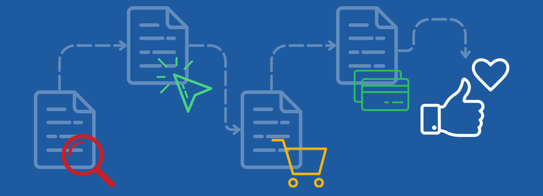
We practice what we preach here at Mopinion. We’ve been collecting customer feedback for years now in an effort to continuously optimise the user experience of the Mopinion software. This feedback has been particularly useful in developing Mopinion Raspberry. By focusing on making the most important components easily accessible and available, workflows have become more intuitive and efficient.
The Data Explorer is essentially a new approach to an existing functionality within the Mopinion software. The new Data Explorer makes it possible to visualise data through charts and browse through the feedback (by applying filters and calculations) without having to edit the existing charts. That combined with the new Feedback Quick View Sidebar (see Navigation post) creates a unique way of exploring data visually and drilling down on particular feedback items instantly.
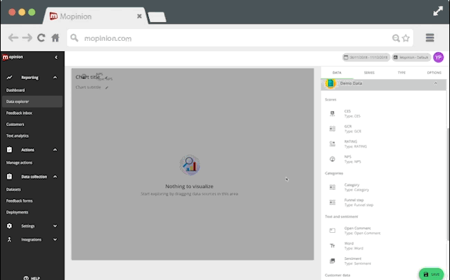
With this feature you can visualise your calculations in a personalised chart, which makes it possible to compare sets of data and results in one overview. Want to make specific calculations? We’ve made sure that the most popular calculation types are available to you. For instance, using an NPS data type, you can apply a calculation to view promoters. Alternatively you can also create a separate calculation to view the detractors. Simply click on the Quick View Sidebar to use the applied filters and toggle the categories (‘Series’, ‘Type’, etc) to your preference.
A brief explanation of the categories
The ‘series’ tab enables users to select the actual data series to be used for the chart. Here you can manage things like the calculation that is applied to a certain series (e.g. use feedback data from items containing…). The ‘type’ tab enables users to select chart visualisation types such as a line graph, bar graph or pie chart. And lastly, there’s the ‘options’ tab which is used for setting up general chart options such as scale, (data) labels and legends.
Are there specific feedback results that you’d like to regularly keep track of? For example, Net Promoter Score? Then you’ll want to have these results easily at your disposal. And that’s when the Chart Builder comes in handy. You decide what you want to see and how you want it to be displayed for quick and easy analysis.
Note: while some packages have a limitation in terms of charts you can use, the Data Explorer allows you to work with different charts even when you’ve reached the maximum amount of allotted charts.
Unlimited possibilities with the Chart Builder
The Mopinion Chart Builder is a feature used to visualise feedback results. So how does it work? Once you have your chart ready, you can easily zoom in on the feedback items relating to a data point by clicking on it.. Previously it wasn’t possible to drilldown on feedback items from the Chart Builder. In Mopinion Raspberry, the Quick View Sidebar allows you to drill down on relevant feedback anywhere it’s mentioned in the platform. That includes the Chart Builder! This creates an entirely new way of analysing your data and will also save you a lot of time.
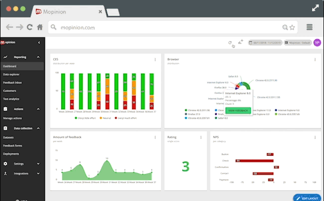
Want to work with some of our standard charts? Just save them and drag them to your dashboard. The dashboard shows you real-time data and can be arranged however you like with your most critical or commonly reviewed charts.
Are you ready for Mopinion Raspberry?
And that concludes the Mopinion Raspberry unmasking series! We hope that this series has provided you with a bit of insight into what the new user interface, Mopinion Raspberry has in store for you!
Beta testing is still ongoing so stay tuned for the definitive launch date!
Want to become a beta tester?
[For existing customers only]