

Online feedback forms help you understand what visitors need, where they encounter problems and how they experience your website or app. To build an effective form, start with one clear objective, choose relevant questions, create an accessible design and display it at the right moment in the customer journey.
Perhaps visitors are abandoning your checkout. Maybe customers cannot find the information they need. Or you want to understand how people experience a newly launched feature. A well-designed feedback form gives visitors a way to explain what is happening, in their own words.
In this guide, we’ll walk through three steps to creating effective online feedback forms: build, design and configure. You’ll also find question examples and practical advice for turning responses into improvements.
TL;DR – Article summary:
- Start with one clear objective and decide who should answer.
- Choose questions and metrics that match the experience you want to understand.
- Combine a rating question with a relevant open-ended follow-up.
- Keep your form short, accessible and easy to use on mobile.
- Display feedback requests at relevant moments in the customer journey.
- Analyse responses, assign actions and track what changes.
What is an online feedback form?
An online feedback form is a digital questionnaire used to collect people’s opinions, experiences and suggestions. Businesses use these forms on websites and in apps to understand customer needs, identify usability issues and improve digital experiences.
A feedback form might ask whether a visitor found an article helpful, how easy it was to complete a purchase or what prevented someone from finishing a task.
Feedback forms and online surveys overlap. For this guide, we’re focusing on short, contextual forms that help you understand a specific interaction or moment in the customer journey.
Define your feedback form’s objective and audience
Before choosing questions or colours, decide what you want to learn. A form with one clear purpose is easier to design and gives you a clearer direction when reviewing responses.
For example, you might want to understand:
- Why visitors leave without purchasing.
- Whether customers can complete a registration.
- How easy it is to find relevant product information.
- Whether a support article answers the reader’s question.
- What users think of a new app feature.
Turn that objective into a specific question for your team: “What do we need to understand, and what decision will this feedback help us make?”

- Collect unlimited feedback
- ■
- Free 14 day trial
Choose who should answer
Your audience should match your objective. Someone who has just completed a purchase can comment on checkout. A first-time visitor may be better placed to explain whether your product information is clear.
Avoid asking people to assess experiences they have not had. For example, a visitor who has only just discovered your website may not have enough experience with your business to answer a recommendation question meaningfully.
Deciding who should answer also helps you choose where and when to display your form.
The examples below use Mopinion. The screenshots illustrate the original workflow; the current interface may differ.
1. Build: Choose the right feedback form questions
An effective online feedback form asks questions that directly support its objective. Start with the information you need, then choose the question types that make it easy for visitors to respond.
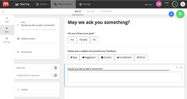
A useful starting point is one rating or multiple-choice question followed by an open-ended question. The first helps you identify patterns; the second helps explain them.
Choose a metric that matches your objective
Different feedback metrics answer different questions. You do not need to include all of them in one form.
- Customer Satisfaction (CSAT): Measures satisfaction with a particular experience, product or service. For example: “How satisfied are you with your checkout experience?”
- Customer Effort Score (CES): Measures how easy or difficult customers perceive an interaction to be. For example: “How easy was it to complete your registration?”
- Goal completion: Asks whether visitors achieved what they came to do. For example: “Were you able to find the information you needed?” This captures reported success among respondents, rather than measuring every visitor’s behaviour.
- Net Promoter Score (NPS): Measures customers’ likelihood to recommend your business on a scale from 0 to 10. Respondents are classified as promoters (9–10), passives (7–8) or detractors (0–6). Use it when customers have enough experience with your business to make that assessment.
Keep question wording, scale labels and reporting methods consistent when comparing results over time.
Alongside rating scales, you can use multiple-choice questions, drop-down lists and feedback categories such as bugs, suggestions or content. Choose the format that suits the information you need.
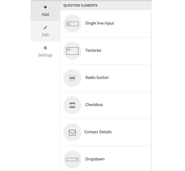
Add open-ended questions to understand why
A score can highlight a problem, but it rarely explains the cause.
If a customer says checkout was difficult, an open-ended follow-up such as “What made completing your purchase difficult?” gives them space to describe the issue.
Other useful questions include:
- “What information was missing?”
- “What were you trying to do?”
- “What could we improve?”
- “What worked well for you?”
Keep your wording neutral. “What did you think of the new feature?” leaves room for a wider range of answers than “How much did you enjoy our new feature?”
Ask about one thing at a time, too. Combining website speed, navigation and design into a single question makes the response difficult to interpret.
Use question routing to keep forms relevant
Question routing, also called conditional logic, shows or hides questions based on previous answers.
For example, if a visitor says they could not complete their task, ask what prevented them. If they completed it successfully, you might ask what could make the experience easier next time.
Mopinion’s website feedback software supports question routing, helping you tailor the form to each respondent’s answers.

For responses that need clarification, AI follow-up questions can ask relevant follow-ups based on what someone has written. This provides a way to explore unclear feedback without adding the same fixed questions for everyone.
Ask for contact details only when needed
Contact details can be useful when someone wants a response or needs help resolving an issue. However, they should serve a clear purpose.
If follow-up is relevant, consider an optional email field with wording such as: “Would you like us to contact you about your feedback?”
Explain how the information will be used and link to your privacy information. Avoid asking for a full name, email address and telephone number when one optional contact field would meet your needs.
Keep your feedback form focused
There is no single ideal length for every feedback form. For feedback about a specific interaction, start with one focused question and a relevant follow-up.
Before adding another question, ask whether the answer will help your team make a decision or take action. Use routing to avoid showing visitors questions that do not apply to them.
2. Design: Make your feedback form easy to use
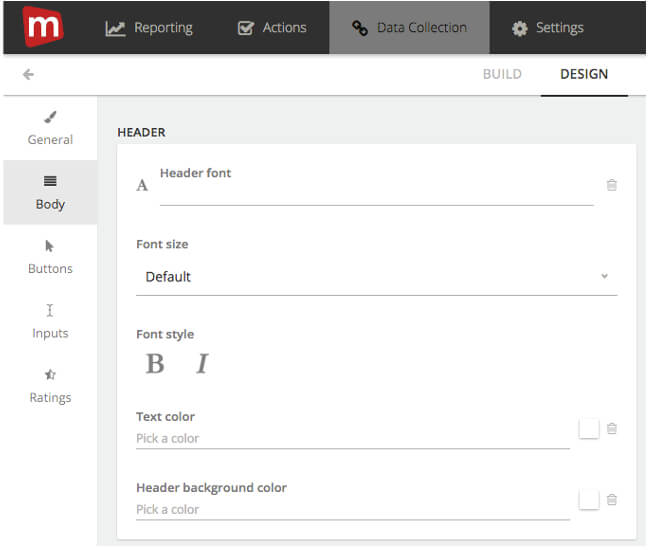
Feedback form design should help visitors understand what you are asking and how to respond. A form can match your brand while remaining simple, readable and easy to navigate.
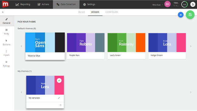
Match your brand and prioritise readability
Use your brand colours, typography and tone of voice to make the form feel familiar. Keep the layout focused, with enough space between questions and a clear submission button.
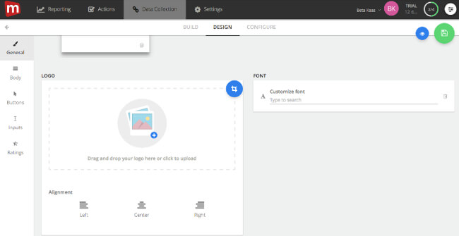
When reviewing your design, check that:
- Text is easy to read against the background.
- Questions and response options are clearly grouped.
- Buttons are easy to identify.
- Required and optional fields are clearly marked.
- Error messages explain how to fix a problem.
Keep required fields to a minimum. A visitor may have useful feedback to share even if they do not want to answer every question.
Use clear labels and instructions
Visitors should not have to guess what belongs in a field. Use descriptive labels, and add short instructions where the expected response needs explanation.
Placeholder text should not be the only way to identify a field, because it disappears when someone starts typing. The W3C’s guidance on labelling form controls explains how labels help people understand and use forms, including those using assistive technology.
Check accessibility and mobile usability
Test your form on the devices your audience uses. A layout that looks clear on a desktop screen may be difficult to complete on a phone.
Check that visitors can navigate with a keyboard, see which field is selected and understand any validation messages. On mobile, make sure buttons are easy to tap and the on-screen keyboard does not hide essential controls.
Also check that visitors can close a modal form easily and return to their original task.
3. Configure: Show your feedback form at the right moment
The timing and placement of your feedback form influence which experiences people can comment on. Match your request to the task, page or interaction you want to understand.
You can offer a feedback button for visitors who want to share something themselves, or proactively invite feedback after a relevant event.
Collect feedback after task completion
The end of a task is a useful opportunity to ask about the experience someone has just had.
Examples include:
- Completing a purchase.
- Creating an account.
- Submitting a support request.
- Using a specific app feature.
Ask about that interaction directly. After registration, for example, “How easy was it to create your account?” is more focused than “What do you think of our website?”
Remember that completion-page feedback only reaches people who finished. To understand unsuccessful journeys, you will also need opportunities for visitors to report problems before completing the task.
Offer a feedback button for visitor-led responses
A visible website feedback button lets people share an issue or suggestion when they choose.
This can be useful for reporting bugs, flagging missing information or describing an unexpected problem. Keep the button easy to find without obstructing navigation or important page controls.

For implementation guidance, read our guide to adding a feedback form to your website.
Use exit-intent feedback appropriately
Exit-intent forms invite feedback when a visitor shows behaviour associated with leaving a page. They can help you explore why someone has not completed a purchase or found what they need.
For example, you could ask: “What, if anything, prevented you from completing your purchase today?”
An exit-intent trigger predicts possible departure; it does not confirm that someone will leave. Mopinion’s on-page-leave trigger is available on desktop and laptop devices, so mobile journeys need a different approach.
Set targeting rules and manage frequency
Targeting rules help you decide where, when and to whom a form appears. Depending on your setup, these can include page URLs, time on a page, visitor behaviour or other conditions.
Avoid interrupting people before they have had a chance to experience the page. Also check how frequently visitors receive requests, particularly when several feedback campaigns are active.

Mopinion’s guide to targeting and publishing feedback forms explains how deployment conditions and triggers work together.
Preview and test before publishing
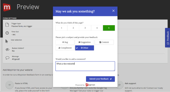
Before launching your form, preview its appearance and check the complete experience on your website or app.
- Does it appear on the intended pages and devices?
- Do the questions and routing work correctly?
- Can visitors close, complete and submit it?
- Is the confirmation message clear?
- Do responses arrive with the information your team needs?
Test each conditional path, including validation messages and optional fields.
Online feedback form examples
The right feedback questions depend on what you want to learn. These examples provide a starting point you can adapt to your audience and customer journey.
Website task-completion feedback
Objective: Understand whether visitors achieved their goal.
- Question: “Were you able to do what you came here to do?”
- Response options: Yes / Partly / No
- Follow-up for Partly or No: “What prevented you from completing your task?”
This helps you identify obstacles among people who respond and investigate the reasons behind incomplete journeys.
Checkout feedback
Objective: Understand how customers experienced a completed purchase.
- Question: “How easy was it to complete your purchase?”
- Response scale: Very difficult to Very easy
- Follow-up: “What could we improve about the checkout process?”
Use this after purchase completion. To investigate abandonment, use a separate form that asks about the unfinished journey.
Content feedback
Objective: Find out whether a page answers visitors’ questions.
- Question: “Was this information helpful?”
- Response options: Yes / Partly / No
- Follow-up for Partly or No: “What information was missing or unclear?”
This can help content teams identify pages that need clearer explanations or additional information.
Bug-reporting feedback
Objective: Understand a technical problem.
- Question: “What went wrong?”
- Follow-up: “What were you trying to do when the problem happened?”
Provide an optional contact field if your team may need more information. Remind visitors to avoid including passwords, payment details or other sensitive information.
Analyse feedback and turn insights into action
Publishing your online feedback form is the beginning. Its value comes from using responses to understand problems and decide what to improve.
Start by grouping feedback into themes such as navigation, payment problems, missing information or technical errors. Then review the comments alongside relevant scores and customer-journey context.
For larger volumes of responses, AI customer feedback analysis can help summarise open-text feedback and surface recurring themes. Review the underlying comments when investigating an issue so that important context is preserved.
Prioritise findings by considering how often an issue appears, how seriously it affects customers and whether it blocks an important task. Remember that feedback represents the people who responded; it should be considered alongside behavioural data and other research.
Assign an owner to each agreed improvement, record the action and check what happens afterwards. Where appropriate, follow up with customers who requested a response.
Mopinion’s Insights and Actions brings feedback analysis and follow-up workflows together to help teams move from findings to action.
Frequently Asked Questions
An online feedback form should include a clear question related to its objective, suitable response options and an opportunity to explain the answer. Add contact details only when follow-up is useful, and make the submission process clear.
There is no single ideal number. For feedback about a specific interaction, start with one focused question and a relevant follow-up. Add questions only when the answers will help you make a decision or take action.
Display it when visitors have enough experience to answer meaningfully. Relevant moments include after a purchase, after using a feature or while viewing content. A feedback button also lets visitors respond at a moment they choose.
A feedback form is a type of survey. In practice, the term often refers to a short questionnaire attached to a particular page or interaction, while surveys can also cover broader topics across multiple questions.
Ask clear, neutral questions, keep the form relevant to the visitor’s experience and make it easy to complete. Use follow-up questions to understand the reasons behind a response, then show customers that their feedback informs improvements.
Ready to see Mopinion in action?
Want to learn more about Mopinion’s all-in-1 user feedback platform? Don’t be shy and take our software for a spin! Do you prefer it a bit more personal? Just book a demo. One of our feedback pro’s will guide you through the software and answer any questions you may have.