
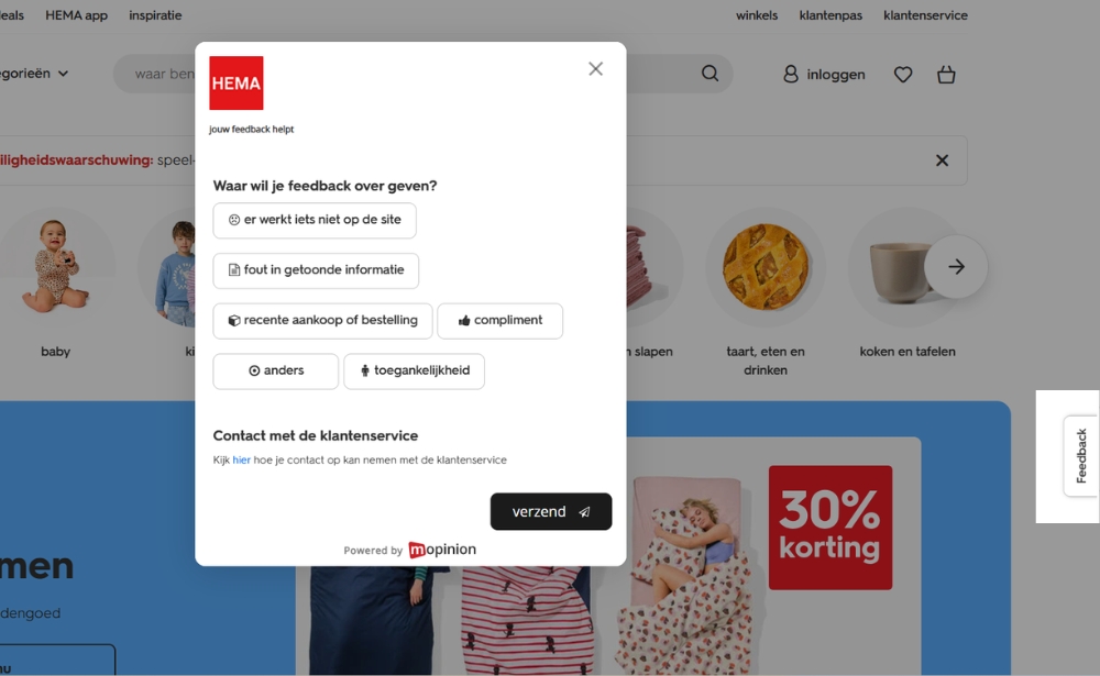
A website feedback button is a clickable tab, icon or floating button that lets visitors share feedback directly from the page they are viewing. When a user clicks it, a short feedback form usually opens as a pop-up, modal or slide-in without taking them away from the website.
Website feedback buttons give visitors an always-available way to tell you when something is confusing, missing or not working. Because the feedback is collected while the experience is still happening, it can give digital teams valuable context that traditional analytics alone cannot provide.
In this guide, we’ll explain how website feedback buttons work, where to place them, what questions to ask and how to use them effectively.
TL;DR – Article summary
- A website feedback button gives visitors an easy way to provide feedback without leaving the page.
- Buttons are usually displayed as a floating icon, side tab or fixed label.
- Clicking the button opens a short website feedback form.
- Feedback buttons are generally passive, meaning the visitor chooses when to provide feedback.
- Placement, visibility, accessibility and question length all influence how easy the button is to use.
- Feedback buttons can help uncover usability problems, missing information, bugs and other friction in the digital journey.
- They work particularly well alongside active feedback forms triggered at specific moments or behaviours.
- The feedback becomes most valuable when teams analyse the responses and use them to improve the website.
What is a website feedback button?
A website feedback button is an on-page element visitors can click whenever they want to share feedback about their experience.
It typically appears as:
- a vertical feedback tab on the side of the screen
- a floating button in one of the bottom corners
- a labelled button such as “Feedback” or “Give feedback”
- an icon that opens a feedback form
When clicked, the button usually opens an online feedback form directly on the page.
Unlike a traditional survey sent by email after an interaction, a website feedback button lets users respond while they are still browsing. That means the feedback is connected more closely to the page, task or problem they were experiencing at that moment.
For example, a visitor could use a feedback button to tell you:
- they cannot find the information they need
- a link or feature is not working
- a page is difficult to understand
- they experienced an issue during checkout
- information is missing
- they have a suggestion for improving the website
This makes website feedback buttons particularly useful for collecting continuous, in-the-moment feedback.
How does a website feedback button work?
A feedback button acts as the entry point to a feedback form.
The basic process is simple:
- 1) A visitor sees the feedback button while browsing your website.
- 2) They click the button when they want to share something.
- 3) A feedback form opens without requiring them to leave the page.
- 4) The visitor answers one or more questions and submits the form.
- 5) The response is sent to your feedback platform for analysis.
Depending on the feedback software you use, additional context can also be captured alongside the response, such as the page URL, device information or other relevant metadata.
This helps teams understand not only what the visitor said, but also where and under what circumstances the feedback was submitted.
Website feedback button vs feedback widget vs feedback form
These terms are sometimes used interchangeably, but they refer to slightly different things.
A website feedback button is the element the visitor clicks.
A feedback form is the survey or set of questions that appears after the button is clicked.
A website feedback widget is a broader term for the on-page feedback mechanism. It may include a feedback button, embedded survey, pop-up, rating widget or another interactive format.
For example, you might have a floating “Feedback” button on the right-hand side of your website.
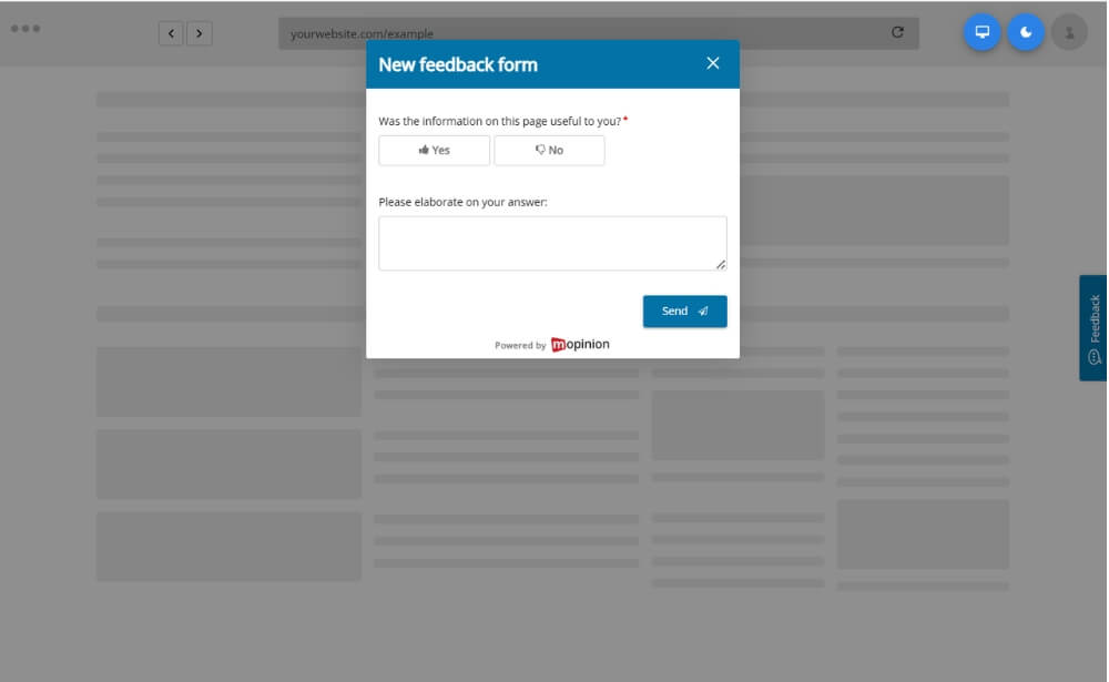
Clicking that button could open a feedback form asking visitors to rate their experience and explain what could be improved.
If you want to explore the broader category, read our guide to website feedback widgets and UX best practices.
Why use a feedback button on your website?
Website analytics are excellent at showing what visitors do.
You might see that:
- visitors abandon a particular page
- a checkout funnel has a high drop-off rate
- people spend very little time on certain content
- users repeatedly leave after performing a particular action
But analytics do not always tell you why.
A feedback button gives visitors an opportunity to explain their experience in their own words.
1. Collect feedback in context
Feedback is often easier to interpret when you know where it came from.
If someone reports that information is unclear while viewing your pricing page, for example, your team immediately has more context than it would from a generic customer survey completed several days later.
2. Give visitors an always-available feedback channel
Because the visitor decides when to open the form, a feedback button provides a low-pressure way to share feedback.
This is particularly useful when someone encounters an issue you could not have predicted in advance.
3. Discover usability issues
Visitors can highlight problems that may not be obvious from analytics, including:
- confusing navigation
- unclear copy
- missing information
- broken functionality
- technical problems
- difficult forms
- unexpected behaviour
These insights can help UX, product and digital teams identify opportunities for improvement.
4. Understand why users struggle
Analytics might tell you that people abandon a particular journey.
Feedback can help explain whether that is because of price, missing information, technical problems, usability issues or something else entirely.
5. Create a continuous feedback channel
A permanent feedback button allows visitors to submit feedback throughout the customer journey rather than only when your organisation launches a survey campaign.
This gives teams a continuous stream of qualitative insight that can complement behavioural and quantitative data.
Where should you place a website feedback button?
There is no single position that works for every website.
The main goal is to make the button easy to find without allowing it to interfere with the task the visitor is trying to complete.
Common placements include:
Floating button in the bottom corner
A floating button remains visible as the visitor moves through the page.
This can work well when you want feedback to remain available throughout the website experience.
Before placing it in the bottom-right corner, check whether other elements such as live chat, accessibility controls or cookie settings already occupy the same space.
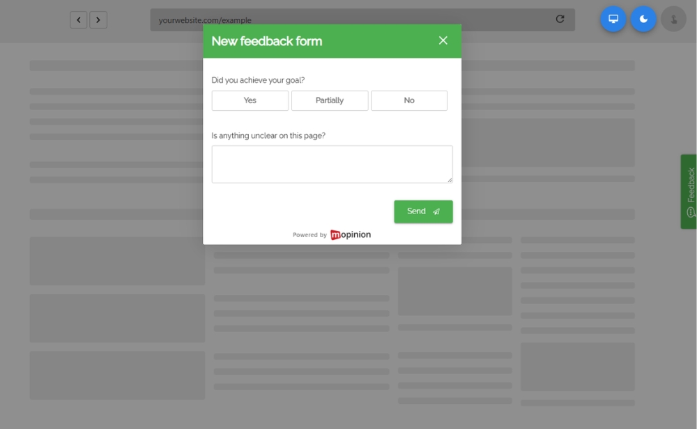
Vertical tab on the side of the page
A vertical Feedback tab attached to the left or right edge of the screen is another common approach.
This keeps the feedback option visible while taking up relatively little space.
Inline feedback button
Sometimes feedback should be associated with a very specific piece of content.
For example, a help article could end with:
Was this article helpful?
This type of feedback control is more contextual than a permanent site-wide button.
Page-specific buttons
You do not necessarily need to display the same feedback button across every page.
You may want to configure different forms or buttons for:
- product pages
- help content
- account areas
- checkout journeys
- search results
- new features
- high-value conversion pages
The right placement ultimately depends on what you want to learn.
What should a website feedback button say?
The label should make the purpose of the button immediately clear.
For general website feedback, simple labels work well:
- Feedback
- Give feedback
- Share feedback
- Tell us what you think
However, contextual wording can sometimes make the purpose clearer.
For example:
- Found an issue?
- Was this page helpful?
- Missing something?
- How was your experience?
A checkout page, help centre and product dashboard may therefore benefit from different wording.
Whatever copy you choose, visitors should understand what will happen when they select the button.
What questions should you ask in a website feedback form?
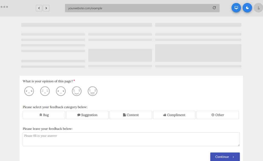
A website feedback button should normally open a relatively short form.
Visitors clicked the button because they wanted to tell you something. Requiring them to complete a long survey can add unnecessary friction.
The W3C’s guidance on accessible forms similarly recommends keeping forms simple and only requesting information that is actually required.
A general website feedback form could ask:
How would you rate your experience on this website?
Followed by:
What could we improve?
Other useful questions include:
- Did you find what you were looking for?
- Were you able to complete your goal today?
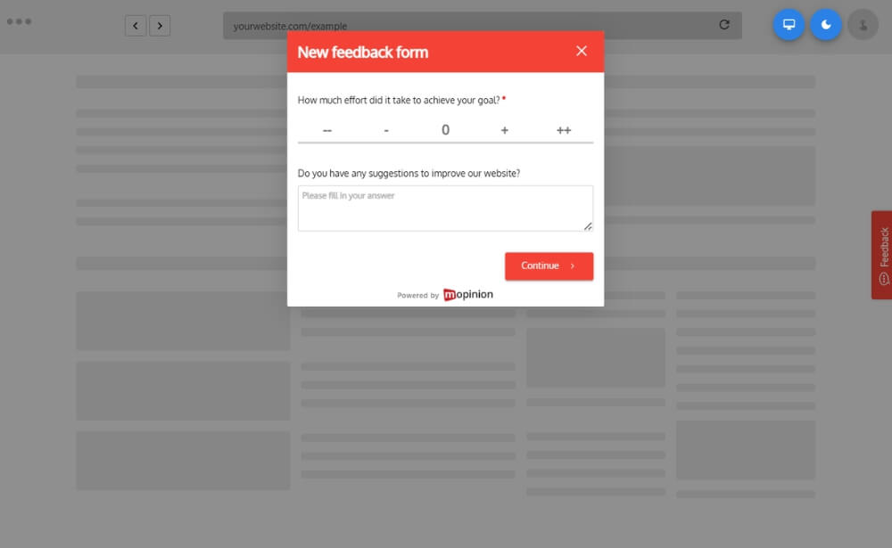
- How easy was it to complete your task?
- What is the main reason for your score?
- Is anything missing from this page?
- Did you experience a problem?
- What could we do to improve this page?
The questions should always reflect the page and the information your team actually needs.
For more ideas, see our guide to building effective online feedback forms.
Website feedback button examples and use cases
A feedback button can support many different parts of the digital customer journey.
General website feedback
A permanent feedback button can be available across the website so users can comment whenever they encounter an issue or have a suggestion.
This is useful for identifying unexpected problems that targeted surveys may miss.
Content feedback
On blogs, help centres or knowledge bases, you could ask:
Was this information helpful?
Visitors who answer negatively can then be asked what information was missing.
This can help content teams identify gaps and improve existing pages.
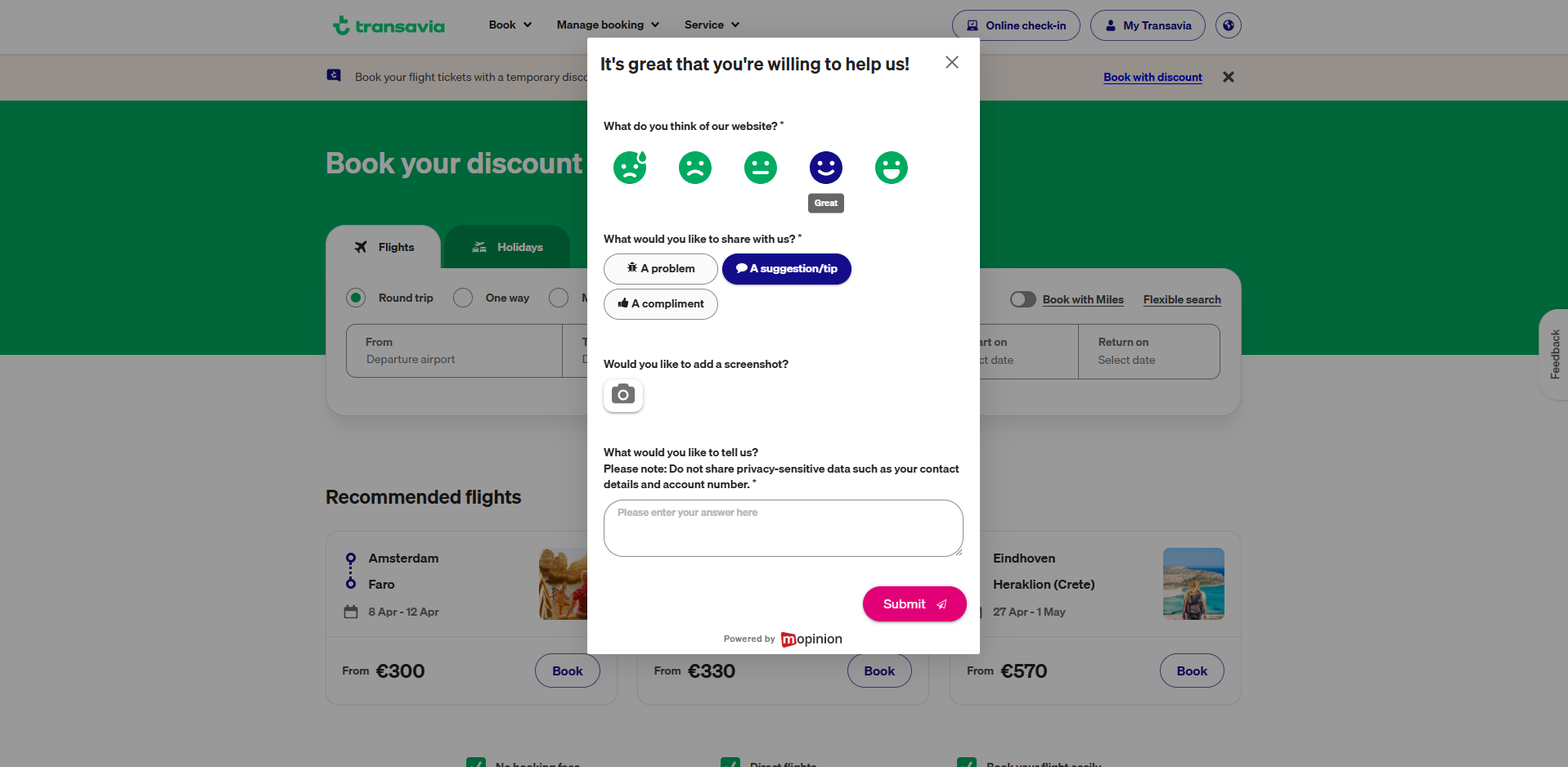
Product and feature feedback
For digital products, feedback buttons can give users an easy way to share their experience with a particular feature.
For example:
How was your experience using this feature?
You could then use an open-text follow-up to understand the reason behind the rating.
Website redesign feedback
After launching a new website or redesigning an important page, a feedback button can provide visitors with a direct channel for reporting confusion, bugs or other problems.
Bug and issue reporting
You can also use the button specifically to capture problems.
A label such as “Report an issue” makes the intent clear and allows users to explain what went wrong.
Conversion journey feedback
On high-value journeys such as quote requests, sign-up flows and checkouts, feedback can reveal why visitors struggle or abandon the process.
For these situations, however, a passive feedback button is often most powerful when combined with an active, behaviour-triggered survey.
Website feedback button best practices
Simply placing a feedback button on your website does not guarantee useful feedback.
The design and setup should make it easy for visitors to participate while keeping the website experience itself the priority.
1. Make the button visible but not intrusive
Visitors should be able to locate the button when they need it, but it should not cover important content or compete with your primary call to action.
Test its placement across different screen sizes.
2. Keep the feedback form short
Ask only what you actually need to know.
A rating or closed question followed by one open-text question is often enough to understand both the visitor’s experience and the reason behind it.
3. Match the question to the page
Generic questions can produce generic feedback.
Instead of asking every visitor “What do you think of our website?”, consider asking a question related to the task they are completing.
For example:
Did you find the information you were looking for?
This gives the response much clearer context.

4. Optimise the button for mobile
Check whether the feedback button is comfortable to select on smaller screens and whether it overlaps other elements.
Accessibility should be part of this decision too. WCAG 2.2 includes minimum requirements around the size and spacing of pointer targets, helping users activate controls without accidentally selecting nearby elements.
You can find the full guidance in the WCAG 2.2 target size requirements.
5. Make the button accessible
A feedback mechanism should be usable by as many visitors as possible.
Consider:
- sufficient colour contrast
- clear labels
- keyboard navigation
- visible focus states
- accessible form controls
- appropriate button size and spacing
Accessibility should apply to both the button and the feedback form it opens.
6. Avoid overlapping other website elements
Floating controls can easily compete with:
- live chat buttons
- cookie controls
- accessibility widgets
- navigation
- mobile browser controls
Review the button as part of the complete interface rather than designing it in isolation.
7. Analyse feedback alongside behavioural data
Collecting feedback is only the first step.
Look for recurring themes and compare what customers say with what your analytics show.
For example, if analytics indicate a high drop-off rate on a particular page and visitors repeatedly mention unclear information, the two data sources together provide a much stronger signal.
8. Act on what you learn
Feedback becomes valuable when it leads to improvement.
Teams should have a clear process for:
- reviewing incoming feedback
- identifying recurring themes
- routing issues to the right teams
- prioritising improvements
- tracking changes over time
This helps turn website feedback into a continuous optimisation process rather than simply another source of data.
Passive vs active website feedback
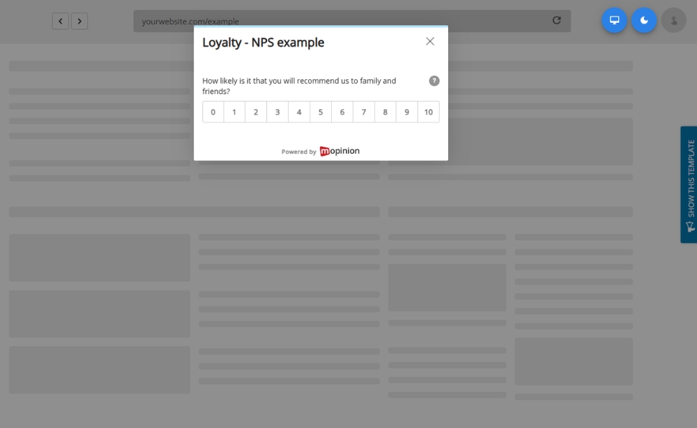
A website feedback button is usually considered a form of passive feedback collection.
Passive does not mean the organisation is doing nothing. It simply means that the visitor initiates the feedback interaction.
They see the button and decide whether and when to click it.
Active feedback works differently.
An active feedback form is initiated by the organisation based on a particular behaviour, condition or moment in the journey.
For example, you might display a survey:
- when someone shows exit intent
- after they spend a certain amount of time on a page
- after they complete a purchase
- after reaching a particular step in a journey
- when they abandon a process
Neither approach is inherently better.
A passive button is useful because visitors can speak up whenever they want. Active surveys allow you to ask targeted questions at strategically relevant moments.
Combining both can therefore give you a more complete website feedback programme.
How to add a feedback button to your website
The exact implementation depends on the feedback platform you use.
With a dedicated website feedback solution, the process typically involves:
- 1) Creating your feedback form.
- 2) Choosing which questions to include.
- 3) Customising the button or tab.
- 4) Choosing its position.
- 5) Defining where the button should appear.
- 6) Adding the deployment code to your website.
- 7) Testing the experience on desktop and mobile.
- 8) Publishing the feedback form.
You can also create different forms for different pages and audiences rather than displaying one generic survey everywhere.
For a full walkthrough, read our guide on how to add a feedback form to your website.
How Mopinion helps you collect website feedback
Mopinion enables digital teams to create custom website feedback forms and deploy them across different pages and journeys.
You can use Mopinion to create passive feedback buttons as well as active feedback forms triggered according to visitor behaviour or other conditions.
Forms can be adapted to different use cases, from general website satisfaction to page-specific feedback, goal completion and usability research.
Once feedback starts coming in, teams can analyse responses in Mopinion, identify patterns and combine quantitative scores with qualitative comments to better understand the digital experience.
Mopinion is part of Netigate, bringing digital experience feedback together with a broader experience management offering.
Want to see how it works? Start a free Mopinion trial.
Frequently Asked Questions
Ready to see Mopinion in action?
Want to learn more about Mopinion’s all-in-1 user feedback platform? Don’t be shy and take our software for a spin! Do you prefer it a bit more personal? Just book a demo. One of our feedback pro’s will guide you through the software and answer any questions you may have.